110
\$\begingroup\$

You may have noticed that the site got a bit less blue today!

Thank you so much for your input over the last few weeks. This has been a great process and I really hope you like your new theme. We took your very helpful feedback and made some adjustments

  • Reworked the logo to look more like a medal
  • Addressed concerns about legibility for the site name when presented on a textured background
  • Changed the text used in the banner to be more representative of Code Golfing
  • Adjusted the colors of the links & tags to fit the theme better

In addition, we've customized your Chat theme and Twitter account and if you get the newsletter, you'll see a change there, too. If you're noticing your privileges have changed, they've been updated to the higher levels.

Oh, and you're now officially just "Code Golf". The site name in the site switcher, footer, and full site list has been updated to reflect that decision.

If you see any design bugs that need squishing, please let us know!

Thanks so much to everyone who helped and gave feedback and thanks to Lisa for her work on this design.

UPDATE:

Thanks for your feedback! I've compiled this for Lisa to review and work on.

\$\endgroup\$
18
  • 1
    \$\begingroup\$ Official name must be a bit cached... :P \$\endgroup\$ Commented Jun 11, 2019 at 19:17
  • 1
    \$\begingroup\$ How long should we hold before complaining about the site still being called by its old name? \$\endgroup\$
    – Adám
    Commented Jun 11, 2019 at 19:24
  • 1
    \$\begingroup\$ @Adám Where does that happen? I can't see it anywhere except chat. \$\endgroup\$
    – Dennis Mod
    Commented Jun 11, 2019 at 19:26
  • 22
    \$\begingroup\$ @Dennis always PPCG in our hearts \$\endgroup\$
    – tuskiomi
    Commented Jun 11, 2019 at 19:27
  • 1
    \$\begingroup\$ @Dennis Oh, now the search bar changed too. But the Tour page still says PPCG. \$\endgroup\$
    – Adám
    Commented Jun 11, 2019 at 19:28
  • 2
    \$\begingroup\$ @Draco18s You mean CG&CC - "CG - double C" \$\endgroup\$
    – Catija StaffMod
    Commented Jun 11, 2019 at 19:33
  • 6
    \$\begingroup\$ Not that I really participate in this site, but I just wanted to say... it's looking good! \$\endgroup\$ Commented Jun 11, 2019 at 23:14
  • 5
    \$\begingroup\$ I thought the preview you showed us looked pretty alright but seeing it live is actually really awesome. Thanks! \$\endgroup\$
    – Poke
    Commented Jun 12, 2019 at 5:45
  • 22
    \$\begingroup\$ For what it's worth, I would like to say that the header looks much better with varied code and that fade out effect. \$\endgroup\$
    – Fatalize
    Commented Jun 12, 2019 at 9:45
  • 1
    \$\begingroup\$ @gparyani If you have an error to report, please do so. \$\endgroup\$
    – Catija StaffMod
    Commented Jun 12, 2019 at 15:46
  • 1
    \$\begingroup\$ Did some testing and it appears to be a CDN issue, so I'll just wait. \$\endgroup\$
    – gparyani
    Commented Jun 12, 2019 at 16:08
  • 1
    \$\begingroup\$ Looks like they tried to get as far away from the November 1st meme as possible. \$\endgroup\$
    – mbomb007
    Commented Jun 12, 2019 at 21:38
  • 2
    \$\begingroup\$ @Oliver That's something your mods can actually fix. I can poke it if they don't get to it first. \$\endgroup\$
    – Catija StaffMod
    Commented Jun 25, 2019 at 17:47
  • 1
    \$\begingroup\$ @Catija Do you know if we get swag like I believe other newly graduated sites have done in the past; and if so, when? \$\endgroup\$ Commented Jul 6, 2019 at 21:31
  • 2
    \$\begingroup\$ @JonathanAllan I don't have an answer for you right now. I'm very much in favor of swag for designed sites but we're mid-distributor changeover and still figuring out what swag will look like moving forward. I hope to have an answer to that by August, though, so stay tuned! \$\endgroup\$
    – Catija StaffMod
    Commented Jul 8, 2019 at 22:50

14 Answers 14

69
\$\begingroup\$

With the new site design, unvisited links are green, whereas visited links are very dark green, almost black:

enter image description here

enter image description here

The almost black color for visited links makes them look as if there is no link. There's still the underline, but the main visual hint of a link, which is the color, is gone. In addition, aesthetically the difference between the two colors is too large. Having clicked on a link should change its color, but not effectively remove the color altogether.

Can we have a not so dark color for visited links? Dark green is fine, just not so dark that it looks black.

\$\endgroup\$
7
  • 2
    \$\begingroup\$ Absolutely, the current colour is indistinguishable from black and black is a lousy colour for hyperlinks. \$\endgroup\$
    – Mast
    Commented Jun 13, 2019 at 6:41
  • 2
    \$\begingroup\$ Most underrated suggestion! \$\endgroup\$ Commented Jun 14, 2019 at 17:48
  • 1
    \$\begingroup\$ Not a single downvote... \$\endgroup\$ Commented Jun 17, 2019 at 9:03
  • 3
    \$\begingroup\$ It's apparently quite difficult to have three different colors for visited, unvisited, and hover that can both be recognized as distinct from each other and as separate from black and legible at all.... and look nice. I understand the reasoning here but I'm concerned that what we've got now may be the least bad option. Underlining isn't possible in markup, so there will never be black underlined text unless it's a link. Can we make this work as-is? Or are there suggestions of what to do instead? We have limited color choices with the theme... Thoughts? \$\endgroup\$
    – Catija StaffMod
    Commented Jul 11, 2019 at 6:00
  • 1
    \$\begingroup\$ Feel free to discuss in chat. \$\endgroup\$
    – Catija StaffMod
    Commented Jul 11, 2019 at 6:48
  • 3
    \$\begingroup\$ We've switched the color to a dark teal. It's different but somewhat harmonious with the current theme. It's distinguishable from black and the green without being too bright or too "primary" seeming to leave people wondering which is the unvisited color. It also brings in a touch of the blue from the logo. \$\endgroup\$
    – Catija StaffMod
    Commented Jul 17, 2019 at 18:43
  • 1
    \$\begingroup\$ Thank you for taking our feedback into account. I think the dark teal does a good job. The visited links don't look black anymore, yet their colour is duller than that of unvisited links; which is fitting because it makes the visited links grab less attention \$\endgroup\$
    – Luis Mendo
    Commented Jul 17, 2019 at 21:54
40
\$\begingroup\$

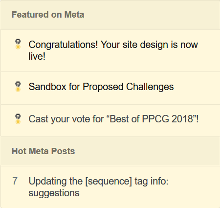
In the Hot Network Questions panel, the yellow medal clashes with the white background and makes it a bit indistinguishable as a medal.

enter image description here

Consider adding a dark border around the medal.

enter image description here

Better yet, like Adám suggested, add a dark background to the logo.

\$\endgroup\$
3
  • 3
    \$\begingroup\$ Giving it a codegolf-charcoal dark circular background would fix that. \$\endgroup\$
    – Adám
    Commented Jun 11, 2019 at 19:48
  • 11
    \$\begingroup\$ Yeah. :/ We've got to address this for browser tabs and the Featured box, too... it won't be until next week, though. Thanks! :D \$\endgroup\$
    – Catija StaffMod
    Commented Jun 11, 2019 at 19:49
  • 2
    \$\begingroup\$ The bare medal also doesn't work well on the chat button green: i.imgur.com/eOgbQN9.png \$\endgroup\$
    – Adám
    Commented Jun 11, 2019 at 21:57
36
\$\begingroup\$

Earlier, we were told:

The design uses has the standard circle for badges to match the circle part of the medal in the logo.

At the time, the medal in the logo only had a plain circle. Now it has two concentric ones:

enter image description here

Can our badge icons reflect that change in the medal? Something like on EL&U would work:

enter image description here

\$\endgroup\$
1
  • 7
    \$\begingroup\$ Done! :D Wonders of having so many different badges already. :D \$\endgroup\$
    – Catija StaffMod
    Commented Jul 16, 2019 at 22:35
33
\$\begingroup\$

The meta logo is too colourful. Other meta logos are either entirely grey-scale or have just a tiny coloured details, not a major blob of colour:

meta logo

Maybe go with a silver medal for meta?

silver meta medal

Or maybe just making the centre silver, with the gold ring remaining as a coloured detail, like other meta logos:

silver meta medal with gold accent

Or white with gold accent:

white meta medal with gold accent

\$\endgroup\$
7
  • \$\begingroup\$ How about keeping just the outer circle gold, so the majority colour is still grey? \$\endgroup\$ Commented Jun 14, 2019 at 11:04
  • \$\begingroup\$ @trichoplax Excellent idea, that fits with the other meta icons. I've added two possibilities. \$\endgroup\$
    – Adám
    Commented Jun 14, 2019 at 13:13
  • \$\begingroup\$ -1 I like it as is. \$\endgroup\$
    – Poke
    Commented Jun 14, 2019 at 15:28
  • 1
    \$\begingroup\$ I like the second one the best \$\endgroup\$
    – MilkyWay90
    Commented Jun 16, 2019 at 1:10
  • \$\begingroup\$ I like all of these (including the current all gold medal). \$\endgroup\$ Commented Jun 17, 2019 at 9:03
  • 2
    \$\begingroup\$ @MilkyWay90 I also like the all-silver one best. \$\endgroup\$
    – Adám
    Commented Jun 17, 2019 at 9:36
  • 1
    \$\begingroup\$ I like the silver medal. Meta icons are supposed to be grayscale! +1 \$\endgroup\$ Commented Jun 28, 2019 at 14:37
24
\$\begingroup\$

The images linked on the pages for:

do not exist (404 – file not found).

\$\endgroup\$
4
  • \$\begingroup\$ Same issue for those pages on meta codegolf.meta.stackexchange.com/error \$\endgroup\$
    – Dan
    Commented Jun 24, 2019 at 10:53
  • 2
    \$\begingroup\$ They're generic images but they're not broken! \$\endgroup\$
    – Catija StaffMod
    Commented Jul 17, 2019 at 18:33
  • \$\begingroup\$ @Catija: Now they are. Before, there weren’t even the generic images. \$\endgroup\$
    – Wrzlprmft
    Commented Jul 17, 2019 at 19:53
  • 2
    \$\begingroup\$ Yes. Sorry, my statement was unclear. It was in reference to the "status completed" tag... My brain meant "we've fixed this... the images we've added are generic images but ...". If that makes sense? :P \$\endgroup\$
    – Catija StaffMod
    Commented Jul 17, 2019 at 19:54
23
\$\begingroup\$

The meta favicon looks off in my browser:

enter image description here

I am on Chrome version 73 using the Morpheon Dark theme.


Edit: this appears to be resolved now.

enter image description here

\$\endgroup\$
4
  • 7
    \$\begingroup\$ Hmmmm... yeah, looks like there's a white artifact. Will look at that. Thanks! \$\endgroup\$
    – Catija StaffMod
    Commented Jun 11, 2019 at 20:38
  • 1
    \$\begingroup\$ @Catija Fixed, no? \$\endgroup\$
    – Adám
    Commented Jul 17, 2019 at 18:09
  • \$\begingroup\$ @Adám It appears to be fixed now - I updated this post. \$\endgroup\$
    – Oliver
    Commented Jul 17, 2019 at 18:17
  • 3
    \$\begingroup\$ Yep, @Oliver There was an artefact in the template we were using that was kinda invisible. On inspection we found it and eradicated it so that it wouldn't muck up future favicons (Anime also got hit by this). \$\endgroup\$
    – Catija StaffMod
    Commented Jul 17, 2019 at 18:35
22
\$\begingroup\$

The privileges page has way too little contrast. I can imagine those with poor eyesight will have to give up reading it: almost white - on white

\$\endgroup\$
7
  • 1
    \$\begingroup\$ Can look at this but it'd be more of a network-wide change. It's similarly low-contrast on most sites. We grey-out the ones you have, but you can hover over them to see them in full-color, just like low-scoring answers. There's much higher contrast for items you don't have... but you have them all. \$\endgroup\$
    – Catija StaffMod
    Commented Jun 11, 2019 at 19:42
  • 15
    \$\begingroup\$ @Catija In other words, I can only read about what I cannot do, but not about what I can do? Also, some devices (like phones and tablets) and browsers (those that use keystrokes for link navigation) don't really have the concept of hovering. \$\endgroup\$
    – Adám
    Commented Jun 11, 2019 at 19:45
  • 2
    \$\begingroup\$ As I said... network-wide change. We want our sites to be accessible and there's a handful of things we did in the long-ago times that were cool but made things difficult for some people, including people on phones. We're actively looking to fix those things. \$\endgroup\$
    – Catija StaffMod
    Commented Jun 11, 2019 at 19:47
  • 2
    \$\begingroup\$ @Catija I think you should actually invert those: you can see the ones you can do, but the ones you can't are greyed out. Or, better still, use some other high-contrast highlighting method. (Note: as the public representative, you are singularly and personally responsible for all of the design team's work.) \$\endgroup\$
    – wizzwizz4
    Commented Jun 11, 2019 at 20:46
  • 5
    \$\begingroup\$ @wizzwizz4 Heck, even just getting rid of the shading entirely in favor of the check mark would be plenty. Don't really need both. But this is pre-existing from the design change, it just changed from blue to green and, from comparing, they look equally low-contrast to me. The most effective way to get something like this implemented/fixed is to post a bug report as a question. Since it's network-wide, on MSE would be awesome. This seems like something worth fixing, so please, one of y'all, ask. \$\endgroup\$
    – Catija StaffMod
    Commented Jun 11, 2019 at 21:07
  • 6
    \$\begingroup\$ @Catija meta.stackexchange.com/q/329383/317948 \$\endgroup\$
    – Adám
    Commented Jun 11, 2019 at 21:24
  • 2
    \$\begingroup\$ Thanks :D Looks good. \$\endgroup\$
    – Catija StaffMod
    Commented Jun 11, 2019 at 21:25
15
\$\begingroup\$

The green background of the site bubble on the all sites page seems a bit over-saturated compared to all the other sites' desaturated colours:

GREEEEN!

I suppose the icon is cached.

It seems the same green is used for mobile chat:

more green!!!

I think taking the charcoal background from the new banner would work better both places.

\$\endgroup\$
6
  • 2
    \$\begingroup\$ I mean... it's not any more saturated than SharePoint. ;) The logo's also got the light-colored brackets and medal, so the darker color may be needed for them to be really visible. \$\endgroup\$
    – Catija StaffMod
    Commented Jun 11, 2019 at 19:34
  • 1
    \$\begingroup\$ @Catija SharePoint is dark neutral, not a saturated colour. At first I thought it was highlighted because it was the site I was currently on. \$\endgroup\$
    – Adám
    Commented Jun 11, 2019 at 19:36
  • 3
    \$\begingroup\$ Sorry... bad humor... shouldn't try to be silly in comments... particularly when I apparently don't remember the difference between value and saturation. We'll see if we can find something a little less eye-catching. \$\endgroup\$
    – Catija StaffMod
    Commented Jun 11, 2019 at 21:49
  • \$\begingroup\$ @Catija Looks fixed. \$\endgroup\$
    – Adám
    Commented Jul 17, 2019 at 18:08
  • \$\begingroup\$ @Catija But the harsh chat background colour is still there. \$\endgroup\$
    – Adám
    Commented Jul 17, 2019 at 18:38
  • 2
    \$\begingroup\$ It's forthcoming. There was a slight hiccup with the two (related) requests in a single answer and my failing to effectively communicate both parts of it but we'll get it updated soon-ish. :D Thanks for the heads-up. \$\endgroup\$
    – Catija StaffMod
    Commented Jul 17, 2019 at 18:48
15
\$\begingroup\$

We're going to stick with the blue for contrast and also because it's a traditional color used for first place.

The meta logo looks much more harmonic against the green/charcoal background than the main logo:

meta logo
main logo

Maybe the main ribbon could instead use shades of green?

green ribbon

\$\endgroup\$
1
  • 2
    \$\begingroup\$ Currently, in HNQ and in the favicon, there's no indication that "our colour" is green, only blue and gold :-( \$\endgroup\$
    – Adám
    Commented Jun 12, 2019 at 11:22
10
\$\begingroup\$

The meta favicon has inconsistent medal colour across sizes.

16×16 has silver medal, while larger has gold medal. This shows not just on browser tabs, but also on the featured posts' pane at varying zoom levels. E.g. in FFQ/Win at 140% vs 150%: 140%* 150%

* The missing top part of the cibbon has been addressed separately

\$\endgroup\$
1
  • \$\begingroup\$ @Catja this looks fixed now. \$\endgroup\$
    – Adám
    Commented Jul 17, 2019 at 18:10
9
\$\begingroup\$

There is too little clue about whether I'm on the meta.

If I'm viewing the middle of a long post without links, the only clue would be the left bar. They have a different shade of gray, but that's difficult to remember as I can't think of words distinguishing them. And they may not feel the same at different times of a day. There is a small green or black line on the right of the current tab label. But they are too small to be noticed.

And no I don't want the left bar color on main changed. I'm not sure what could be done for this.

\$\endgroup\$
2
  • \$\begingroup\$ This literally just happened to me. I followed a link from chat, and didn't realize I was on meta. \$\endgroup\$
    – primo
    Commented Jun 13, 2019 at 13:07
  • \$\begingroup\$ Not sure why I had this impression. The default theme doesn't seem to be better. \$\endgroup\$
    – jimmy23013
    Commented Jun 14, 2019 at 5:38
8
\$\begingroup\$

In Area 51 launched sites page and proposal page, still the old icon is displaying for Code Golf.

Area 51

\$\endgroup\$
3
  • 7
    \$\begingroup\$ It also says Code Golf & Programming Puzzles, which hasn't been our name for at least 6 years. \$\endgroup\$
    – Dennis Mod
    Commented Jun 12, 2019 at 18:44
  • 7
    \$\begingroup\$ @Dennis I think all of the sites on Area 51 have their beta names. Software Engineering has their pre-graduation name there: Not Programming Related. \$\endgroup\$
    – Oliver
    Commented Jun 12, 2019 at 19:50
  • 2
    \$\begingroup\$ The logo has updated on its own. :) And we don't change the site names... :D \$\endgroup\$
    – Catija StaffMod
    Commented Jun 26, 2019 at 18:44
3
\$\begingroup\$

The header banner repeats horizontally, but the footer banner does not: very wide screen

\$\endgroup\$
3
  • 6
    \$\begingroup\$ I think that's fine in the footer. Maybe the CGOL board extends to infinity without any live cells. \$\endgroup\$
    – mbomb007
    Commented Jun 12, 2019 at 21:37
  • 1
    \$\begingroup\$ I think that's fine, but better make each connected part complete. Currently it's obviously some almost stable game with both sides cut off. (Not sure the designer still has the full board though.) \$\endgroup\$
    – jimmy23013
    Commented Jun 13, 2019 at 2:02
  • \$\begingroup\$ After looking at it carefully I found it isn't almost stable, but I guess it could be reversed to a few steps. \$\endgroup\$
    – jimmy23013
    Commented Jun 13, 2019 at 2:47
1
\$\begingroup\$

The 16×16 favicons are missing the top (horizontal) part of their ribbons, making especially the meta icon look like a bunny:
Main's current main should be should be main
Meta's current meta should be should be meta*

* the medal colour has been addressed separately

\$\endgroup\$
1
  • 18
    \$\begingroup\$ imo it's better this way - the top line at those sizes would make it almost indistinguishable from the icon being a blue ring above a yellow one. the current also can be thought of as the top being cut off/somewhere higher than the little icon. \$\endgroup\$
    – dzaima
    Commented Jun 12, 2019 at 12:09

You must log in to answer this question.

Not the answer you're looking for? Browse other questions tagged .