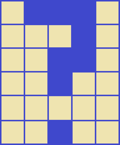
53
\$\begingroup\$

Programming Puzzles & Code Golf will someday graduate out of public beta, and it will get a new site design. Stack Exchange employees generally do all the design work and make the design decisions, but that doesn't mean we can't nudge them in the right direction when the time comes.

This meta post is for discussing and rating ideas about our graduation design; the shapes, colors, icons, images, fonts, etc. to use. There is also a chatroom for brainstorming.

Every answer to this question should be a proposal about one particular aspect of the design. This way each idea can be kept separate from related ideas and be up or downvoted individually.

Here are some specific design aspects that you might make a post about:

  • Main logo (and favicon)
  • Main title
  • Top banner image (e.g. from academia)
  • Background (e.g. from code review)
  • Up and downvote buttons
  • Favorite question button
  • Accepted answer checkmark
  • Badges
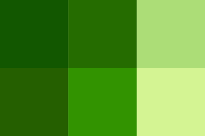
  • Color scheme
  • Guiding principles

Feel free to add to the list if you think something is missing.

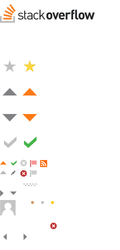
Here is the sprite sheet from Stack Overflow for an idea of what design elements can change. (Many other things can be changed as well.)

SO sprite sheet

(original) (various design components from all sites)

So this question might end up with several answers about each list topic, but the highest voted ones will indicate what we PPCG users really want in our design.

\$\endgroup\$
17
  • 2
    \$\begingroup\$ The operative word in the first sentence being "someday"... \$\endgroup\$ Commented Jan 4, 2016 at 2:12
  • 60
    \$\begingroup\$ "Programming Puzzles & Code Golf will someday graduate out of public beta" [citation-needed] \$\endgroup\$
    – Doorknob Mod
    Commented Jan 4, 2016 at 2:13
  • 16
    \$\begingroup\$ Gosh, going years without graduating has slowly driven us insane. We're that lady who is planning every detail of her future baby's nursery while on her first date. \$\endgroup\$
    – xnor
    Commented Jan 4, 2016 at 6:07
  • 2
    \$\begingroup\$ @xnor After almost five years of PPCG dating Stack Exchange, I think we're well past "first date" territory. While this may indeed be a fruitless endeavor, we can still hope that one day Stack Exchange will finally propose. \$\endgroup\$
    – Alex A. Mod
    Commented Jan 4, 2016 at 6:30
  • 13
    \$\begingroup\$ @AlexA. Actually, I think SE is friend-zoning us... \$\endgroup\$
    – xnor
    Commented Jan 4, 2016 at 6:31
  • \$\begingroup\$ @xnor ._.​​​​​​ \$\endgroup\$
    – Alex A. Mod
    Commented Jan 4, 2016 at 6:33
  • 19
    \$\begingroup\$ @AlexA. SE is telling us "I just want you to be my beta now. It's not you, it's me, I just can't do challenge sites. Maybe in a few years..." Come on SE, what does Code Review have that we don't?! THERE'S MORE TO US THAN OUR QUESTIONS PER DAY. \$\endgroup\$
    – xnor
    Commented Jan 4, 2016 at 6:37
  • 9
    \$\begingroup\$ @xnor Maybe they don't like us because we have long conversations about our relationship in comments. \$\endgroup\$ Commented Jan 4, 2016 at 6:39
  • 4
    \$\begingroup\$ I gasped when I read the title, then I read the beginning and went "Oh...", then I went "Wait Geobits isn't the one making this post?" \$\endgroup\$
    – Fatalize
    Commented Jan 4, 2016 at 14:05
  • 3
    \$\begingroup\$ Voting separately on the different elements is not a good idea. The site should look good as a whole. Good design is not putting together good individual objects. We should somehow create example pages in different designs and vote on these. \$\endgroup\$
    – nimi
    Commented Jan 4, 2016 at 17:44
  • 2
    \$\begingroup\$ @nimi Ultimately our site design upon graduation will be up to the Stack Exchange design team, so as far as I can tell, this is mostly for fun. :P \$\endgroup\$
    – Alex A. Mod
    Commented Jan 4, 2016 at 18:17
  • 3
    \$\begingroup\$ Soemone should make a suggestion for 404 error: StackOverflow's is a polyglot. \$\endgroup\$
    – user46167
    Commented Jan 4, 2016 at 20:56
  • 6
    \$\begingroup\$ @BlockCoder1392 Maybe a random code from here or here (with the language name included). If StackOverflow does a polyglot, then we'll return them the favor by doing a stack overflow! Maybe add "We couldn't find your site, but we found this code that causes a stack overflow..." so we don't get in trouble. \$\endgroup\$
    – geokavel
    Commented Jan 6, 2016 at 3:45
  • \$\begingroup\$ +1 for @geo's suggestion \$\endgroup\$
    – user46167
    Commented Jan 6, 2016 at 22:06
  • 2
    \$\begingroup\$ So... What happened to this? \$\endgroup\$
    – ericw31415
    Commented Dec 30, 2017 at 1:56

19 Answers 19

74
\$\begingroup\$

No relation to the sport golf

There should be nothing related to actual golf in the design. Our name may make for good puns, but it would be way too cheesy to be used.

\$\endgroup\$
7
  • \$\begingroup\$ Agreed. The only connection that physical golf and code golf have is that we try to get the hole/solution in as few hits/bytes as possible. \$\endgroup\$ Commented Jan 4, 2016 at 2:15
  • 20
    \$\begingroup\$ Not only would it be annoyingly cheesy, but we might start getting a new type of off topic question: "How can I get 3 strokes off my golf game?" \$\endgroup\$
    – Alex A. Mod
    Commented Jan 4, 2016 at 3:35
  • 30
    \$\begingroup\$ @AlexA. Have you tried using jQuery? \$\endgroup\$
    – user45941
    Commented Jan 4, 2016 at 5:32
  • 4
    \$\begingroup\$ Kinda funny that this is the most popular answer since this was the most popular suggestion for a new favicon. \$\endgroup\$
    – Martin Ender Mod
    Commented Jan 4, 2016 at 10:20
  • \$\begingroup\$ I think this is why it's important to discuss more abstract, general points like this. Otherwise we'll spend all our time getting pixel perfect a design we don't really want. \$\endgroup\$ Commented Jan 4, 2016 at 16:10
  • 1
    \$\begingroup\$ @MartinBüttner Granted, that suggested favicon was two years ago. I wouldn't be opposed to having a little golf reference here and there, I just don't want the site to look like a country club. \$\endgroup\$
    – Alex A. Mod
    Commented Jan 4, 2016 at 18:53
  • 9
    \$\begingroup\$ No stubby pencils? What a waste. \$\endgroup\$
    – Shog9
    Commented Jan 6, 2016 at 2:59
62
\$\begingroup\$

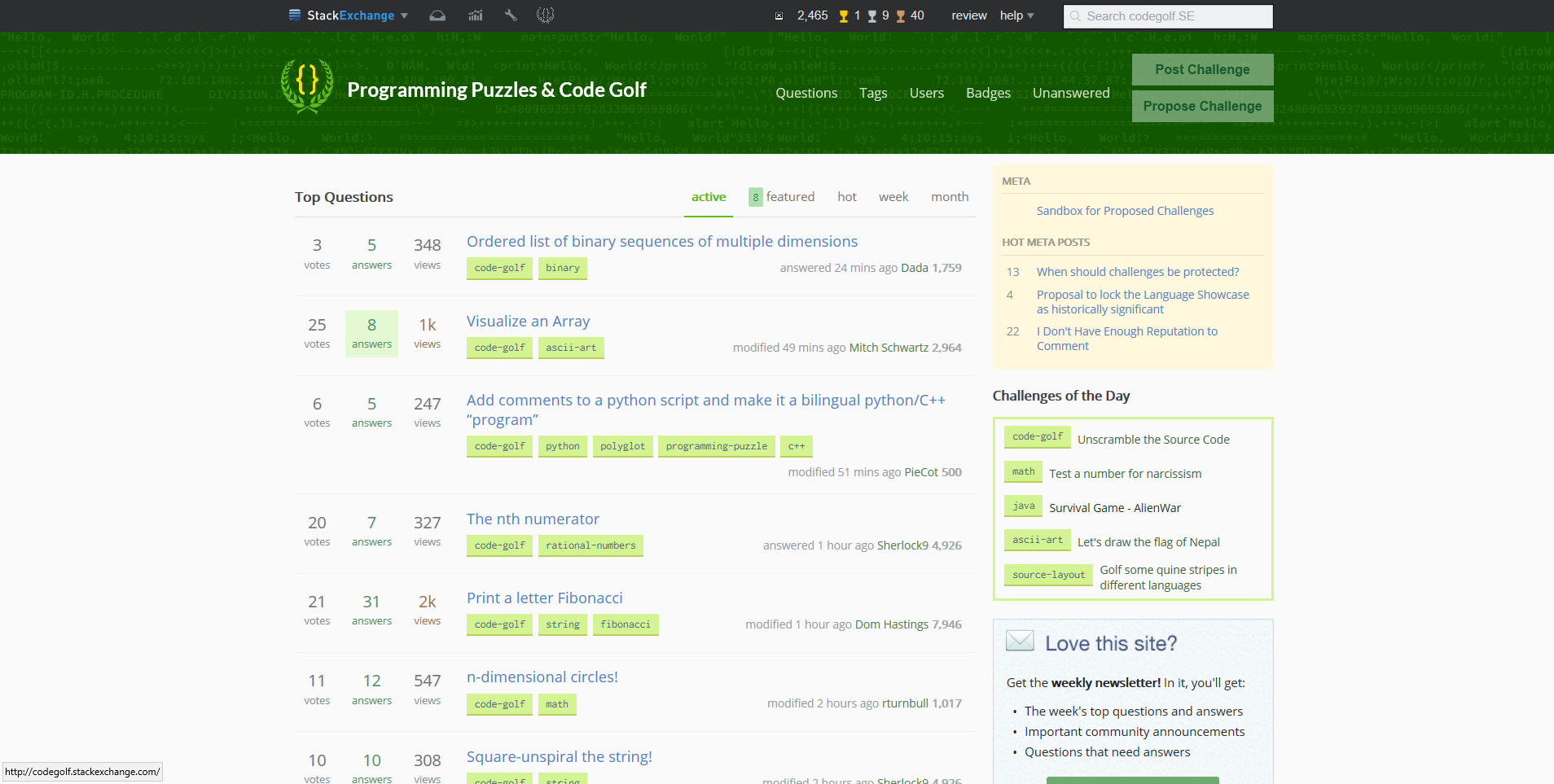
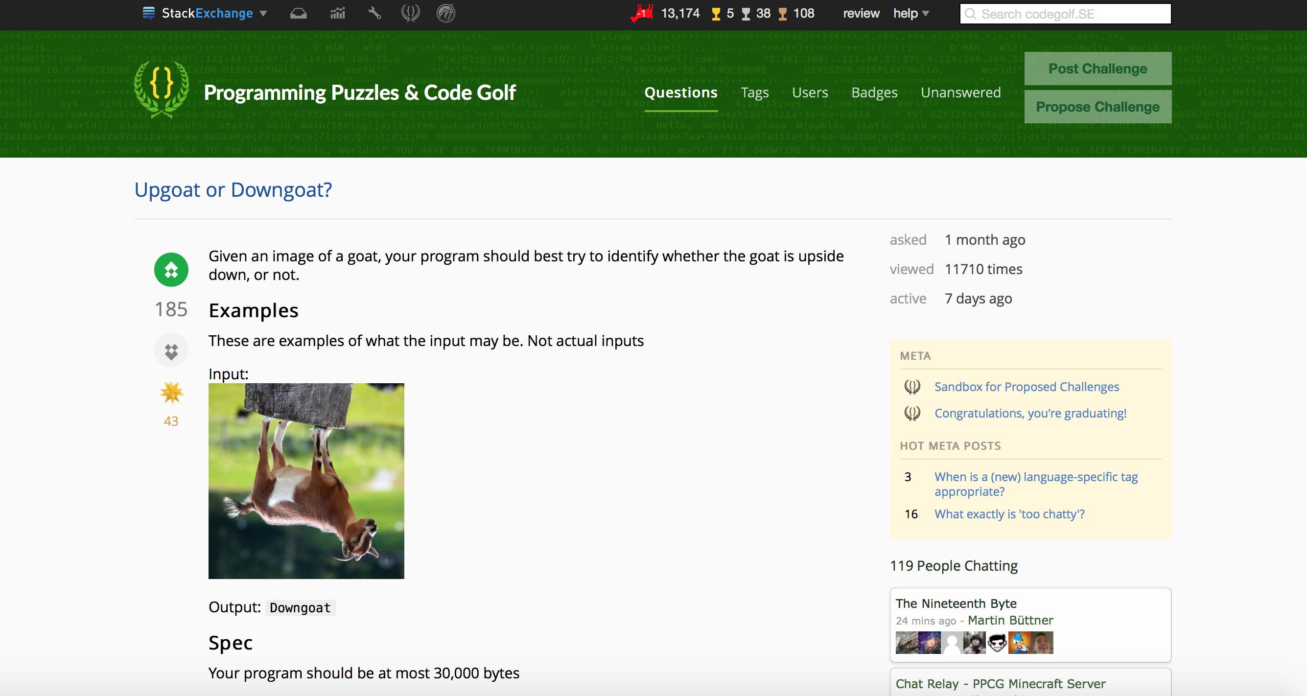
Graduation Design Userscript

A collaborative graduation user-script has been put together. Github Repo

Pictures

Main

enter image description here

Question: enter image description here

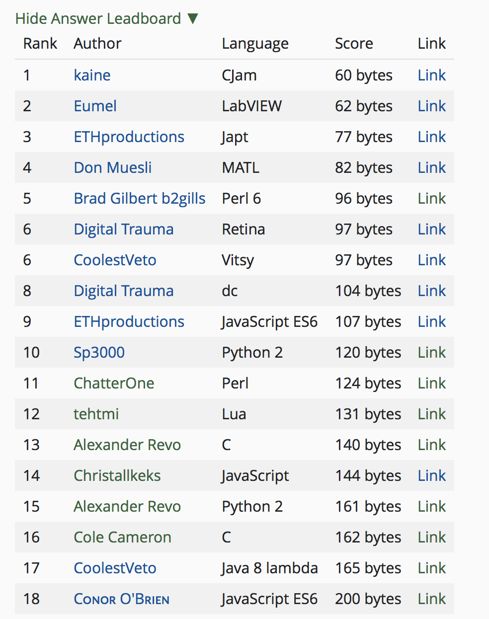
Leaderboard:

Auto TIO Execution:

enter image description here

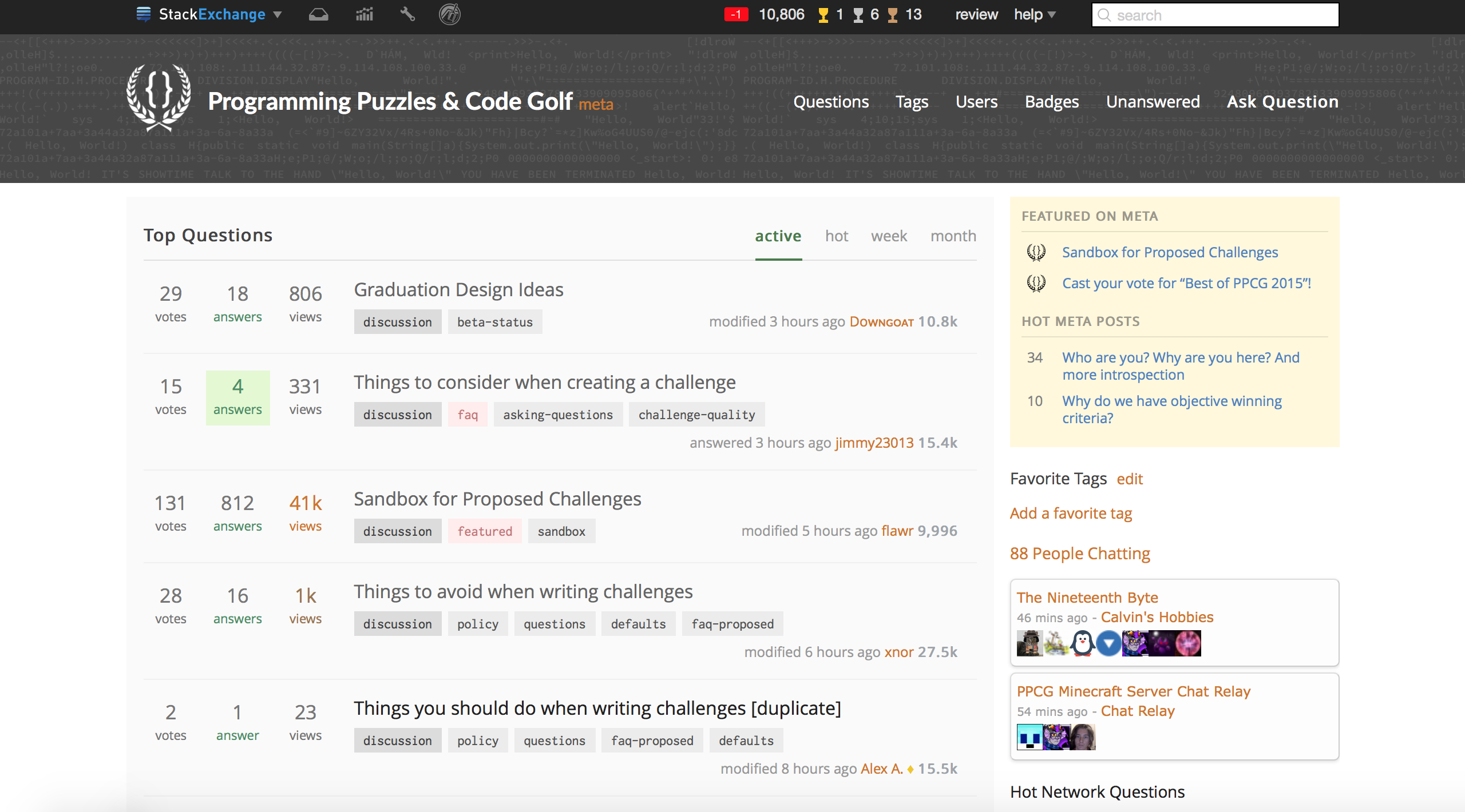
Meta:

enter image description here

Chat: enter image description here

Color Scheme:


If you have any ideas, don't hesitate to comment below.


Features:

  • See vote counts even if you don't have enough rep.
  • Automatic leaderboards for all code-golf challenges.
  • Automatic code-block byte and char counting. (For bytes, uses UTF-8/16, ISO 8859-1, or byte-per-char, depending on the language. Hexdumps are parsed correctly as well.)
  • An options button to customize the theme, colors, and disable/enable various features.
  • A Question of the day widget.
  • Automatic TIO™ preview. See an answers output without leaving PPCG! (this can be disabled)

Design Features:

  • New Logo / Voting / Favorite / Badge icons
  • General redesign
  • Customizable parts:

    • Header font and colors
    • Text font and color
    • Logo / Spritesheet
    • Background image / color
    • Post container color
    • and more!

How do I use this?

You can install Tampermonkey which supports a ton of browsers (probably will include yours). You can then just use this link to install the script (or copy-paste the code into a new script).

\$\endgroup\$
23
  • 1
    \$\begingroup\$ Counting bytes and chars might be useful. \$\endgroup\$ Commented Jan 5, 2016 at 6:10
  • 33
    \$\begingroup\$ I was wondering why you would move the notification alerts to the right. Then I realized it was your avatar >.> \$\endgroup\$
    – user42643
    Commented Jan 5, 2016 at 6:58
  • \$\begingroup\$ The star of the favorite icon doesn't seem to be aligned properly with the number below it (From your screenshot). \$\endgroup\$
    – Spikatrix
    Commented Jan 5, 2016 at 12:51
  • \$\begingroup\$ Seeing the logo in the design, i think it is a bit thick. If anyone wants to tinker with it, I can upload the vector source somewhere. \$\endgroup\$
    – user42643
    Commented Jan 5, 2016 at 13:14
  • 7
    \$\begingroup\$ This is really nice, but I'm concerned that we may have too much game of life. It works for the upvotes, but using beehives for badges also makes it seem like game of life is a really important part of the site. \$\endgroup\$
    – Maltysen
    Commented Jan 5, 2016 at 17:00
  • \$\begingroup\$ @mınxomaτ could you upload vector? I'd like to try to fiddle with the colors, etc. \$\endgroup\$
    – Downgoat
    Commented Jan 5, 2016 at 23:29
  • \$\begingroup\$ @Doᴡɴɢᴏᴀᴛ Sure (Inkscape SVG(!), be sure to save as "Optimized SVG"(!) when using it in a design, or else some browsers won't handle it correctly): workupload.com/file/OS0ZAtch \$\endgroup\$
    – user42643
    Commented Jan 5, 2016 at 23:37
  • \$\begingroup\$ This doesn't load the logo next to the meta site name for me. \$\endgroup\$
    – user45941
    Commented Jan 7, 2016 at 15:37
  • \$\begingroup\$ @Calvin'sHobbies A char-counter has been added, along with support for hexdumps, and custom encodings for specific languages. \$\endgroup\$ Commented Jan 7, 2016 at 19:25
  • \$\begingroup\$ @Mego Should be fixed now. \$\endgroup\$ Commented Jan 7, 2016 at 19:25
  • \$\begingroup\$ Also, Greasemonkey for Firefox. \$\endgroup\$
    – Hipe99
    Commented Jan 11, 2016 at 5:26
  • 8
    \$\begingroup\$ I hate the favourite button, it looks like a bomb. \$\endgroup\$
    – Xwtek
    Commented Jan 12, 2016 at 11:19
  • \$\begingroup\$ It seems like bold text doesn't get rendered when previewing answers: i.imgur.com/rG1co1D.png \$\endgroup\$
    – xenia
    Commented Jan 24, 2016 at 16:58
  • 1
    \$\begingroup\$ Your spelling is bad: i.imgur.com/wwD4tIK.png \$\endgroup\$
    – user45941
    Commented Feb 10, 2016 at 18:42
  • 1
    \$\begingroup\$ @Mego I do not see the issue \$\endgroup\$
    – Downgoat
    Commented Apr 1, 2016 at 15:25
52
\$\begingroup\$

Vote Boat Buttons - Game of Life Boats

They could be boat still life's from Conway's game of life.

Upvote:

Downvote:

These are Phi's circular rotated versions, which I think work much better.

With glowyness (credit to Cᴏɴᴏʀ O'Bʀɪᴇɴ):

Doᴡɴɢᴏᴀᴛ's boats:

The main fun part with these is that then it could be called upboating and downboating.

If you have an image for this design that's not too different, feel free to edit the post and include it.

\$\endgroup\$
14
  • 23
    \$\begingroup\$ What if I misspell "downboat"as "downgoat"? :P \$\endgroup\$
    – user46167
    Commented Jan 4, 2016 at 2:09
  • 11
    \$\begingroup\$ +1 for Phi's suggestion \$\endgroup\$
    – Alex A. Mod
    Commented Jan 4, 2016 at 3:41
  • 11
    \$\begingroup\$ For me, the connection to programming puzzles is too tenuous. \$\endgroup\$
    – lirtosiast
    Commented Jan 4, 2016 at 4:02
  • 4
    \$\begingroup\$ @ThomasKwa Granted. It's going more for our esoteric angle. \$\endgroup\$ Commented Jan 4, 2016 at 4:03
  • \$\begingroup\$ I'll work on adding this today. It seems to be the best idea so far. \$\endgroup\$ Commented Jan 4, 2016 at 12:04
  • \$\begingroup\$ Phi's icon looks great! \$\endgroup\$
    – J Atkin
    Commented Jan 4, 2016 at 23:47
  • 2
    \$\begingroup\$ Wow, there's more than an vote icon here! I think this has potential as a favicon! See my separate answer. \$\endgroup\$ Commented Jan 5, 2016 at 0:12
  • 3
    \$\begingroup\$ I love the idea. But turned 45 degrees I hardly recognize them as Life's boats \$\endgroup\$
    – Luis Mendo
    Commented Jan 5, 2016 at 4:04
  • 4
    \$\begingroup\$ I think the downboats look too much like dropbox's logo. \$\endgroup\$
    – xenia
    Commented Jan 5, 2016 at 15:55
  • 3
    \$\begingroup\$ But what if there is eventually a Conway's Stack Exchange? \$\endgroup\$
    – mbomb007
    Commented Feb 15, 2016 at 17:35
  • 4
    \$\begingroup\$ Is the downboat too similar to a smiley? Maybe a simple ++ and -- would be better? \$\endgroup\$ Commented Feb 22, 2016 at 19:07
  • 2
    \$\begingroup\$ I agree, they look like smileys. As much as I like downvotes, they shouldn't look like happy faces. \$\endgroup\$
    – Geobits
    Commented Feb 25, 2016 at 16:01
  • \$\begingroup\$ @ev3commander MISspell? Don't you mean spell correctly! ;) \$\endgroup\$ Commented Jan 8, 2017 at 3:41
  • \$\begingroup\$ An upboat for "upboat". \$\endgroup\$
    – emanresu A
    Commented Apr 4, 2021 at 11:12
48
\$\begingroup\$

Another logo!

enter image description here

Credits to @Dennis and several other people who helped me with the idea! This seems to be better because it suggests that PPCG is a competitive site.

Here is a cropped image for use as a favicon, here is an auto-generated SVG version, and here is a greyscale version for Meta.

This has been added to the userscript managed by Downgoat.

\$\endgroup\$
17
  • 1
    \$\begingroup\$ Oooh, I like this one :) \$\endgroup\$ Commented Jan 6, 2016 at 14:52
  • 1
    \$\begingroup\$ I think this is really nice. \$\endgroup\$
    – PhiNotPi
    Commented Jan 6, 2016 at 16:01
  • 2
    \$\begingroup\$ Agreed. Plus it's a lot more intuitive than the zippered one. \$\endgroup\$ Commented Jan 6, 2016 at 21:05
  • 2
    \$\begingroup\$ Could you upload a vector version? \$\endgroup\$
    – Downgoat
    Commented Jan 6, 2016 at 21:06
  • 3
    \$\begingroup\$ Surprisingly, this scales down reasonably well. The leaves lose their definition (not massively important) but the bigger issue is that the yellow brackets all but disappear. I guess they could be in a different colour in the scaled down version. Yellow obviously alludes to gold, but so does orange. Either way, this is the best so far! \$\endgroup\$ Commented Jan 6, 2016 at 21:53
  • \$\begingroup\$ @steveverrill: We've got a chatroom for design discussion. That said, Dennis has pointed out multiple times that puzzles aren't really on-topic and thus they shouldn't be incorporated in to the design, and I agree, so I won't be doing any further work in that direction. \$\endgroup\$ Commented Jan 6, 2016 at 22:33
  • \$\begingroup\$ @Doᴡɴɢᴏᴀᴛ I'll try. \$\endgroup\$ Commented Jan 7, 2016 at 1:25
  • \$\begingroup\$ This is just Tex-Latex... \$\endgroup\$
    – user46167
    Commented Jan 7, 2016 at 1:27
  • 1
    \$\begingroup\$ This logo is a lot clearer then the other one. \$\endgroup\$
    – DJMcMayhem
    Commented Jan 7, 2016 at 20:14
  • 3
    \$\begingroup\$ I'd just like to point out that {} is what our rival site Code Review uses as their badge icons... \$\endgroup\$
    – Alex A. Mod
    Commented Jan 16, 2016 at 0:43
  • 3
    \$\begingroup\$ But they don't use wreaths, do they? \$\endgroup\$ Commented Jan 16, 2016 at 2:31
  • \$\begingroup\$ Yellow on white is a poor choice in my opinion. Can we change that yello into something else that has a nicer contrast with white? \$\endgroup\$
    – Luis Mendo
    Commented Feb 15, 2016 at 22:37
  • \$\begingroup\$ @LuisMendo If you have the official userscript, you will notice that we will not be putting the logo over white. \$\endgroup\$ Commented Feb 15, 2016 at 22:47
  • \$\begingroup\$ @ӍѲꝆΛҐӍΛПҒЦꝆ Yes, sorry, I hadn't seen that. Dennis sent me a link \$\endgroup\$
    – Luis Mendo
    Commented Feb 16, 2016 at 10:04
  • \$\begingroup\$ The SVG link is dead. :( \$\endgroup\$ Commented Dec 4, 2017 at 18:42
33
\$\begingroup\$

Guiding Principle/Color Scheme - Anything but blue

All beta Stack Exchange sites have the same light blue design which I am kind of sick of, but it doesn't stop there. Looking at all the SE sites, I quickly categorized the non-beta computer-related sites as blue or not blue, based on their icon colors.

Blue: (or blueish components)

  • super user
  • web applications
  • webmasters
  • user experience
  • unix and linux
  • theoretical computer science
  • ask different
  • programmers
  • information security
  • database administrators
  • code review
  • drupal answers
  • sharepoint
  • cryptography
  • salesforce
  • network engineering

Not Blue:

  • stack overflow
  • server fault
  • game development
  • android enthusiasts
  • ask ubuntu
  • electrical engineering
  • mathematica
  • rasberry pi
  • tex - latex
  • expressionengineanswers

I'd prefer if PPCG stayed away from this blue trend. Any other dominating color would be fine (perhaps greens?), just not blue!

\$\endgroup\$
5
  • \$\begingroup\$ Maybe use a color palette tool? Here's one I found: paletton.com/… \$\endgroup\$
    – PhiNotPi
    Commented Jan 4, 2016 at 6:02
  • 21
    \$\begingroup\$ Especially since Code Review is blue. We don't want the same color as Code Review do we? ;) \$\endgroup\$
    – Fatalize
    Commented Jan 4, 2016 at 14:03
  • 2
    \$\begingroup\$ Please do also consider visually impaired. (colours that colourblinds can discriminate and generally high contrast.) \$\endgroup\$
    – flawr
    Commented Jan 4, 2016 at 23:26
  • \$\begingroup\$ materialpalette.com/teal/deep-orange \$\endgroup\$
    – J Atkin
    Commented Jan 4, 2016 at 23:54
  • 2
    \$\begingroup\$ I don't really see where you find blue in the TeX stack exchange though \$\endgroup\$
    – Fatalize
    Commented Jan 5, 2016 at 14:24
32
\$\begingroup\$

Let's keep it newcomer-friendly

By all means customise various aspects of the site, but let's have a guiding principle that this shouldn't obscure the intuitive meaning of any of the buttons or symbols. Both users of other Stack Exchange sites and brand new users from outside Stack Exchange should be able to see what is going on without needing to read Meta first.

\$\endgroup\$
30
\$\begingroup\$

"Hello World" Greeting

Many organizations have the word "Welcome" in many languages displayed prominently to show that they are internationally-friendly. How about take a selection of answers from the Hello World catalogue and incorporate them into a watermarked background for the site, or a "Hello World" of the day?

\$\endgroup\$
27
\$\begingroup\$

Main logo - zippered curly brackets

mınxomaτ posted this in chat, so they deserve all the credit:

It's left and right curly brackets ({}) joined by a closed zipper. The brackets indicate that what we do involves coding, and the zipper indicates that we do compression, i.e. golfing (think zip file).

I think it's far more fitting for PPCG than mınxomaτ's other design of the test tube brackets. It scales down pretty well too. My only complaint is that it is not very colorful.

\$\endgroup\$
6
  • 4
    \$\begingroup\$ +1 Colour can come later. In fact you could always change black on white to white on green right now. I like the curly brackets. The question is what to put between them (and I do like a question mark). A vast improvement on minxomat's previous test tube idea. \$\endgroup\$ Commented Jan 5, 2016 at 0:56
  • \$\begingroup\$ Trivia: Nothing scales perfectly. Favicons are mainly drawn by hand, because 16px is below any threshold for many anti-aliasing algorithms. Case in point: Both favicons I posted were redrawn by hand using favicon.cc, a really handy tool. \$\endgroup\$
    – user42643
    Commented Jan 5, 2016 at 13:17
  • 5
    \$\begingroup\$ To be honest this logo makes no sense to me. The majority of the various site logos are at least vaguely descriptive of their sites, but IMO this looks irrelevant to PPCG without explanation. \$\endgroup\$
    – Alex A. Mod
    Commented Jan 5, 2016 at 21:37
  • 4
    \$\begingroup\$ @AlexA. Stack Overflow's logo is a slinky in a box, so comparatively it's pretty clear \$\endgroup\$
    – Downgoat
    Commented Jan 6, 2016 at 5:40
  • 3
    \$\begingroup\$ @Doᴡɴɢᴏᴀᴛ I figured it was a stack overflowing. \$\endgroup\$ Commented Jan 6, 2016 at 5:42
  • \$\begingroup\$ @Downgoat can you add this as an option in the userscript? \$\endgroup\$ Commented Sep 12, 2016 at 23:34
20
\$\begingroup\$

Stack Overflow 404 message

This comment got some up votes, so let me post it as an answer. Maybe someone will want to incorporate this into their UserScript!

If you get a 404 on Stack Overflow, you see a polyglot. We should have something similar, but instead we show a random code from Shortest program that throws StackOverflow Error or Weirdest way to produce a stack overflow (with the language name included). Maybe add "We couldn't find your site, but we found this code that causes a stack overflow..." so we don't get in trouble if people test the code out. Polyglots are sort of a PPCG thing, so PPCG should return SO the favor by making our 404 a Stack Overflow!

\$\endgroup\$
3
  • \$\begingroup\$ I've put this on the userscript. Here's how it looks \$\endgroup\$
    – Downgoat
    Commented Feb 1, 2016 at 4:16
  • 1
    \$\begingroup\$ I think the code shown on our 404 page should be the shortest code to generate a 404 error. That way, the code shown may actually have been the cause of the error. \$\endgroup\$
    – mbomb007
    Commented Feb 19, 2016 at 22:21
  • \$\begingroup\$ +1 for the weirdest way of the stack overflow, \$\endgroup\$
    – masterX244
    Commented May 21, 2016 at 18:55
16
\$\begingroup\$

Top banner image

What if we took some of the most popular answers on the site and make a background out of them? Example:

enter image description here

(Based on @Doᴡɴɢᴏᴀᴛ's idea)

Edit: Now incorporated into Doᴡɴɢᴏᴀᴛ's graduation design userscript:

enter image description here

Slightly recolored.

\$\endgroup\$
12
  • \$\begingroup\$ Do you meant to generate it? Or to just make a png and set that for the background? \$\endgroup\$
    – Downgoat
    Commented Jan 23, 2016 at 6:51
  • 3
    \$\begingroup\$ For me it's too random without a context. \$\endgroup\$
    – geokavel
    Commented Jan 23, 2016 at 22:42
  • 1
    \$\begingroup\$ The idea is to make it look something like the the background for cryptoSE (crypto.stackexchange.com). \$\endgroup\$
    – J Atkin
    Commented Jan 23, 2016 at 22:43
  • \$\begingroup\$ @geokavel I added an improved example of what I intended. \$\endgroup\$
    – J Atkin
    Commented Jan 23, 2016 at 22:58
  • \$\begingroup\$ @Doᴡɴɢᴏᴀᴛ I just noticed my response, it was late ;) I meant that this would be a static resource. \$\endgroup\$
    – J Atkin
    Commented Jan 23, 2016 at 23:05
  • \$\begingroup\$ here's my attempt the colors could be improved. The programs are from the hello world challenge \$\endgroup\$
    – Downgoat
    Commented Jan 25, 2016 at 20:32
  • \$\begingroup\$ I've tried it out on main now and it looks pretty good (once I fix all the image sizing bugs) \$\endgroup\$
    – Downgoat
    Commented Jan 25, 2016 at 21:23
  • \$\begingroup\$ What did you change? I'm not all that familiar with CSS and can't for the life of me get it to work right. \$\endgroup\$
    – J Atkin
    Commented Jan 25, 2016 at 22:22
  • \$\begingroup\$ @JAtkin You'll have to install ppcg.alt.user.js from the github instead. \$\endgroup\$
    – Downgoat
    Commented Jan 26, 2016 at 1:25
  • \$\begingroup\$ Looks good in the UserScript, so I undid my -1. \$\endgroup\$
    – geokavel
    Commented Jan 30, 2016 at 22:38
  • \$\begingroup\$ @JAtkin Can I use this, please? \$\endgroup\$
    – user51533
    Commented Mar 31, 2016 at 13:04
  • \$\begingroup\$ Sure, I don't see why not ;) \$\endgroup\$
    – J Atkin
    Commented Mar 31, 2016 at 13:10
4
\$\begingroup\$

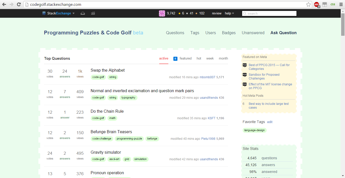
I've been messing around with Stylebot to see what I could do. Below is one possible idea, with a couple main features:

  • Background color surrounds content
  • Green color theme
  • Dashed outlines
  • The questions/tags/etc. navbar has a larger font size.

enter image description here

This is given by the following CSS modifications:

a.question-hyperlink {
    color: #000000;
}

div.status.answered-accepted {
    background-color: #fff8dc;
    border-style: dashed;
    border-color: #ffffff;
    border-width: 3px;
    padding: 3px;
}

#nav-tags {
    font-size: 16px;
}

#nav-questions {
    font-size: 16px;
}

#nav-users {
    font-size: 16px;
}

#nav-unanswered {
    font-size: 16px;
}

#nav-badges {
    font-size: 16px;
}

div.categories {
    background-color: #eafced;
}

div.snippet-hidden {
    border-style: dashed;
    border-color: #eafced;
    border-width: 7px;
}

div.module.community-bulletin {
    border-style: dashed;
    border-width: 3px;
    border-color: #ffffff;
}

div.module.newuser {
    background-color: #eafced;
    border-style: dashed;
    border-width: 3px;
    padding: 3px;
    border-color: #ffffff;
}

a.post-tag {
    color: #000000;
    background-color: #ddffd6;
    border-style: none;
}

#header {
    color: #ffffff;
    background-color: #eafced;
    border-style: solid;
    width: 1000px;
    margin-color: 0;
}

div.container {
    border-color: #ffffff;
    background-color: #eafced;
}

.container {
    box-shadow: none ;
}

#hlogo a {
}

#nav-askquestion {
    font-size: 16px;
}

#footer-menu {
    color: #ff24ff;
}

ol li a {
    color: #306630;
}

div.top-footer-links a {
    color: #457548;
}

div.module {
    border-style: dashed;
    border-width: 3px;
    padding: 3px;
    border-color: #ffffff;
}

For future reference, one problem I ran into was fixing the colors in the upper right and left corners, which was solved with this:

.container {
    box-shadow: none;
}
\$\endgroup\$
3
  • \$\begingroup\$ Note that Conor and Downgoat have made similar changes with userscripts. Maybe we could combine them and post one core version here? \$\endgroup\$ Commented Jan 5, 2016 at 0:28
  • \$\begingroup\$ @Calvin'sHobbies I was thinking that each user script basically acts like its own set of design suggestions. I posted this design here with the idea that someone may choose to incorporate this design into their own. (After an hour or so of using this design, however, I got sick of it, and wouldn't personally recommend it as a final design.) \$\endgroup\$
    – PhiNotPi
    Commented Jan 5, 2016 at 0:48
  • 1
    \$\begingroup\$ Alright. Just thinking that if two userscripts are basically the same they could be combined, but sure, people can post their own for individual ratings. \$\endgroup\$ Commented Jan 5, 2016 at 0:52
4
\$\begingroup\$

Sidebar Links to Important Items

This site is already a large archive of programming questions, but for most users not familiar with the site it is only the front page. There needs to be a way for high quality old questions to be recycled so that they still receive attention. I suggest permanent side-bar links to very-popular tags like and . Also, underneath those should be a list of other popular tags like or that is recycled every so often. Note, there is already a "Frequented Tags" list on the Sidebar, so this proposal could become integrated with that.

Another problem is that there are important questions sitting in Main and Meta that do not have prominent, permanent links to them. Things like Sandbox for Proposed Challenges and the wiki, etc. need to have permanent Sidebar links to them, so that everyone knows the rules from the get-go! Moreover, there should be a page that archives all the questions in an organized way, and it should get a sidebar link. Also, I think interesting reference questions like Showcase of Languages should be on the sidebar, maybe on a recycled basis.

\$\endgroup\$
2
3
\$\begingroup\$

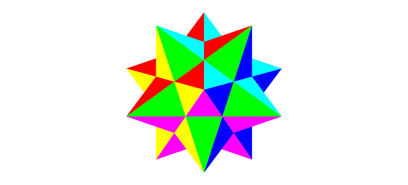
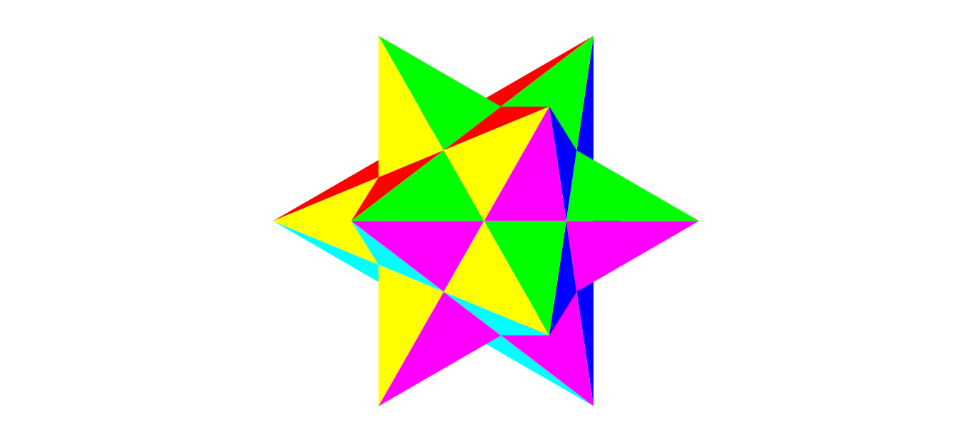
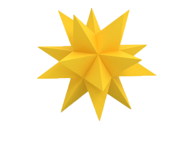
Use Stellated Dodecahedron as the Favorite Star

10 point view

enter image description here

6 point view

enter image description here

Made by @steveverrill

Let's not mess around with baby stars, let's go big with a crazy star! The colored in version would to be for the selected state. There would need to be an outline version for the unselected state.


Here's the version the userscript uses:

enter image description here

\$\endgroup\$
8
  • \$\begingroup\$ Wow, I came here for something else, I didn't expect to find this. I like it but I think the 10 point view may not scale down too well. I've added a 6 point view to my question/answer, It's is a bit simpler. The stellated octahedron also has a 6 point view. \$\endgroup\$ Commented Jan 6, 2016 at 21:27
  • 18
    \$\begingroup\$ Upvote this comment if you prefer the 10 point view \$\endgroup\$ Commented Jan 6, 2016 at 21:27
  • 2
    \$\begingroup\$ Upvote this comment if you prefer the 6 point view \$\endgroup\$ Commented Jan 6, 2016 at 21:28
  • 1
    \$\begingroup\$ @Downgoat that last image you added isn't a (small) stellated dodecahedron (12 points), it's a great stellated dodecahedron (20 points), which is a different polygon from the previous images. I think it looks best of all. You have it in a (slightly offcentre) 10 point view, but the points are much thinner than the ones on the (small) stellated dodecahedron, which will give better definition when scaled down \$\endgroup\$ Commented Jan 7, 2016 at 16:10
  • \$\begingroup\$ @Downgoat I think the one you posted looks to much like the Mathematica logo, but to be fair the one i posted is very similar to the Wolfram Alpha one. \$\endgroup\$
    – geokavel
    Commented Jan 7, 2016 at 16:24
  • \$\begingroup\$ I think i prefer the 6-point now, because it is simpler, and looks different from the stars Wolfram uses. \$\endgroup\$
    – geokavel
    Commented Jan 7, 2016 at 16:32
  • 3
    \$\begingroup\$ The images above hurt my eyes to look at. And I would honestly prefer a regular star over those. \$\endgroup\$
    – mbomb007
    Commented Feb 19, 2016 at 22:25
  • 1
    \$\begingroup\$ I like the last one alot. \$\endgroup\$ Commented Sep 12, 2016 at 23:34
1
\$\begingroup\$

Showcase some of the answers to the question "Images with all colours"

This is our 6th most popular question of all time, and it produced some amazing answers.

Some of these could serve as favicon, or could be displayed in a similar manner to the "images of the month" on photography.SE

Images with all colors

\$\endgroup\$
3
  • \$\begingroup\$ They're currently my backgrounds. :D \$\endgroup\$ Commented Jan 5, 2016 at 4:36
  • \$\begingroup\$ I tinkered around with a couple grayscale versions of these as the background image, but I think they're a little too flamboyant. \$\endgroup\$ Commented Jan 6, 2016 at 20:52
  • 1
    \$\begingroup\$ We could showcase the creepy Mona Lisa image... It's on that challenge where you fill a missing section of an image. \$\endgroup\$
    – mbomb007
    Commented Mar 15, 2016 at 21:50
-5
\$\begingroup\$

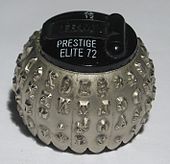
The IBM golfball printer head

I agree with Alex A's comment on Maltysen's very popular answer:

I wouldn't be opposed to having a little golf reference here and there, I just don't want the site to look like a country club. – Alex A

I think a stylized, artistic version of the IBM golfball printer head might work. My main concern is that when scaled down to a favicon it would look too much like a real golfball. Enclosing it in brackets per Blockcoder's answer might help (maybe square instead of curly.)

enter image description here

Image from https://en.wikipedia.org/wiki/IBM_Selectric_typewriter

The other golf reference I'm OK with, is flag icons in the style of golf flags

\$\endgroup\$
1
  • 5
    \$\begingroup\$ I honestly would have had to Google this in order to know what it was. To me, it just looks like a cryptographic metal turd. \$\endgroup\$
    – mbomb007
    Commented Mar 15, 2016 at 21:52
-6
\$\begingroup\$

Icon/Favicon: This and this combined!

\$\endgroup\$
-8
\$\begingroup\$

Vote Buttons - Bracket Fish

They could be the fish symbol ><> from the eponymous esoteric language rotated to vertically point up and down

So perhaps something like

as Conor suggested in chat.

If you have an image for this design feel free to edit the post and include it.

\$\endgroup\$
4
  • 10
    \$\begingroup\$ This design isn't very "readable" to me. I don't really like the fact that is looks like there is a downvote arrow inside of the upvote arrow (I also think you should check your kerning). A single bracket might look nice, though. \$\endgroup\$
    – PhiNotPi
    Commented Jan 4, 2016 at 2:17
  • \$\begingroup\$ @PhiNotPi I agree that a down arrow in the upvote and vice-versa is confusing. Maybe slightly different shaping could avoid that? \$\endgroup\$ Commented Jan 4, 2016 at 2:20
  • \$\begingroup\$ I think if the opposite brackets were connected it would look better. (so more like a diamond followed by an arrow) \$\endgroup\$ Commented Jan 4, 2016 at 2:25
  • 12
    \$\begingroup\$ How about a simple ++ or --? \$\endgroup\$ Commented Jan 4, 2016 at 22:44
-12
\$\begingroup\$

Favicon: Question mark in Conway's game of life

I looked at Calvin's Conway answer, and thought Conway's game of life is the core of the type of thing we do. This would make an excellent scalable icon.

The only thing is, Black and white is a bit boring. I've tried to do something about that in the image below, but it needs more work.

enter image description here

\$\endgroup\$
4
  • 8
    \$\begingroup\$ But this is not a still life or an oscillator as far as I can tell. If the dark blue cells are the alive ones then this dies right away when you run it. So this is just a pattern on a grid. \$\endgroup\$ Commented Jan 5, 2016 at 0:19
  • \$\begingroup\$ @Calvin'sHobbies Does that matter for a logo? I enjoyed the new Star Wars film even though the physics was ridiculous, as were many of the plot points. ("thermal oscillator" anyone?) Also, there's more than one set of rules for Conway's game of life. \$\endgroup\$ Commented Jan 5, 2016 at 0:28
  • 1
    \$\begingroup\$ @Calvin'sHobbies I would have no objection to a proper still life or oscillator being used, though :-) \$\endgroup\$ Commented Jan 5, 2016 at 0:30
  • 1
    \$\begingroup\$ This design dies in 10 generations under standard rules. Deleting the bottom right square gives a pattern that rapidly becomes symmetrical and finally stabilizes as a still life. It looks more like a 7 than a question mark, but its behaviour is more interesting than the 5x3 question mark composed of a standard glider with a dot below it. The dot dies and the glider goes on its way. \$\endgroup\$ Commented Jan 5, 2016 at 1:14
-28
\$\begingroup\$

Another favicon

Here's another favicon that I made.

It's like a contest standings thing, with first, second and third (square brackets, semicolon, and parentheses).

\$\endgroup\$
1
  • 4
    \$\begingroup\$ 22 downvotes...ouch \$\endgroup\$
    – rydwolf
    Commented Apr 17, 2018 at 22:12

You must log in to answer this question.

Not the answer you're looking for? Browse other questions tagged .