28
\$\begingroup\$

We are rolling out the new "stock theme" to the Stack Exchange network. You all are the lucky first site to get the new theme. It is now live.

What new theme?

If you're like, "What the heck are you talking about?", then you should read the Meta Stack Exchange post entitled Rollout of new network site themes (and maybe the posts it links to for the full background).

How does Code Golf get its own custom theme?

One of the goals of this project is to make customizing sites easier so that all sites can have a personalized look (within limits). First we need to convert all current sites to the new unified theme format. Once that is done we will announce the timing and process to roll out personalized themes to sites using the stock theme. We are hopeful this will happen later this year.

Your help needed

Please help us look for issues/bugs. This theme will ultimately be rolled out to 100+ sites. So, it is important to do this trial to make sure things are working well. Please post any issues you see as answers below.

\$\endgroup\$
11
  • 6
    \$\begingroup\$ Should we only comment on technical bugs, or also on how it looks/feels to use? \$\endgroup\$ Commented Aug 3, 2018 at 18:25
  • 3
    \$\begingroup\$ @FryAmTheEggman I would focus here on specific bugs or significant issues. If you have general feedback on our unified themes and the left nav, then I'd encourage you to find the appropriate post on MSE for that. \$\endgroup\$
    – Joe Friend Staff
    Commented Aug 3, 2018 at 18:46
  • 1
    \$\begingroup\$ Does this mean we finally get a theme? \$\endgroup\$
    – Okx
    Commented Aug 3, 2018 at 18:49
  • 2
    \$\begingroup\$ @okx see "how does code golf get its own custom theme?" \$\endgroup\$
    – Joe Friend Staff
    Commented Aug 3, 2018 at 19:07
  • 6
    \$\begingroup\$ I'm only here because this change broke the PPCG Graduation/Design script. … ☹ ☹️ 😢 😭 … (see PPCG.meta/a/7955, StackApps/q/6772 & GitHub/vihanb/PPCG-Design. Looking forward to the day when we get our own official theme. \$\endgroup\$
    – 3D1T0R
    Commented Aug 3, 2018 at 21:54
  • 1
    \$\begingroup\$ @3D1T0R all fixed in latest version 4.0.7 \$\endgroup\$
    – Downgoat
    Commented Aug 3, 2018 at 23:06
  • 1
    \$\begingroup\$ @Downgoat: Thanks. The reasons I mentioned it were to show my appreciation for it, and to spread awareness of it, especially to the SE devs if possible. Perhaps if SE looks at what the community has made for themselves, they'll have a better understanding of what we (as a community) want for our official theme. \$\endgroup\$
    – 3D1T0R
    Commented Aug 3, 2018 at 23:28
  • 5
    \$\begingroup\$ Thank you for coming to us to help test this! I'm excited for the opportunity. \$\endgroup\$
    – isaacg
    Commented Aug 4, 2018 at 3:20
  • 2
    \$\begingroup\$ I'd like to point out that the design script represents a proportion of the community, rather than all of it. I think it's great that it's there for those people who want to use it, but it doesn't represent what everyone would want the official design to look like. \$\endgroup\$ Commented Aug 21, 2018 at 19:06
  • \$\begingroup\$ It's great to see so many answers here - seems you made a good choice of community to test this on. Hopefully this will influence your decision on which community to test customisation on when the time comes... :) \$\endgroup\$ Commented Aug 21, 2018 at 19:23
  • 17
    \$\begingroup\$ @trichoplax Code Golf folks have been great. I really appreciate your help and you all will be duly rewarded. 🌟 \$\endgroup\$
    – Joe Friend Staff
    Commented Aug 21, 2018 at 19:28

24 Answers 24

59
\$\begingroup\$

Voting colors on main site very difficult to distinguish

I have extremely light-sensitive eyes, to the point that I sometimes even need to wear sunglasses indoors. As a result, I have my monitor brightness set to absolute minimum. On this setting, it's extremely difficult to distinguish between "voted on this" vs "not voted on this." The two colors are almost the same.

Raising the brightness (to an uncomfortable level), I can see that the "activated" vote button is a slightly blue-ish shade of grey compared to the unactivated vote button, but the difference is negligible.

Can this be updated to present a bit more contrast between the two states, like is done on the Meta design?

\$\endgroup\$
11
  • 31
    \$\begingroup\$ No vision issues like yours, but I still agree. \$\endgroup\$ Commented Aug 3, 2018 at 19:48
  • \$\begingroup\$ This, at least, is fixed in the community design script. \$\endgroup\$
    – Pavel
    Commented Aug 3, 2018 at 19:53
  • 7
    \$\begingroup\$ Agreed. In meta it looks better. \$\endgroup\$
    – mbomb007
    Commented Aug 3, 2018 at 19:55
  • 1
    \$\begingroup\$ Did anyone else vote on the answer to test this? \$\endgroup\$
    – Jo King Mod
    Commented Aug 3, 2018 at 23:13
  • 6
    \$\begingroup\$ @JoKing: There would be little point, since the issue described is on the main site. \$\endgroup\$
    – 3D1T0R
    Commented Aug 3, 2018 at 23:32
  • \$\begingroup\$ Agrée, i can not say if I have already upvoted a question from the Colors. \$\endgroup\$
    – JayCe
    Commented Aug 4, 2018 at 12:42
  • \$\begingroup\$ Even on a colour monitor it's very hard to tell apart - in monochrome even more so. \$\endgroup\$ Commented Aug 8, 2018 at 8:08
  • 1
    \$\begingroup\$ An improvement would be to use more than just colour to distinguish states - a change in shape or texture (e.g. darker outline vs lighter outline) would help greatly. \$\endgroup\$ Commented Aug 8, 2018 at 8:11
  • \$\begingroup\$ We have improved the contrast. Let me know what you think. \$\endgroup\$
    – Joe Friend Staff
    Commented Aug 13, 2018 at 16:42
  • 4
    \$\begingroup\$ @JoeFriend this is much better after the update. Not sure exactly when you did this, but I guarantee that I felt the difference. This is no longer an issue afaic. \$\endgroup\$
    – JayCe
    Commented Aug 14, 2018 at 1:41
  • \$\begingroup\$ @JoeFriend Can confirm - this is significantly improved. Thanks! \$\endgroup\$ Commented Aug 15, 2018 at 13:53
29
\$\begingroup\$

The box to enter a comment has a red border

Screenshot from meta:

Red border image taken from Meta

This makes me feel like I'm doing something wrong. I think the blue highlight is enough, similar to how it looks when editing an answer.

\$\endgroup\$
5
  • \$\begingroup\$ This also appears in the "insert a hyperlink" popup and "insert an image url" popup \$\endgroup\$
    – Downgoat
    Commented Aug 3, 2018 at 20:23
  • 6
    \$\begingroup\$ Note: Adding such a red outline when something actually is wrong (e.g. when two @mentions are present and thus SE won't let you actually post the comment) would be great, though it might also be more work than it's worth. \$\endgroup\$
    – 3D1T0R
    Commented Aug 3, 2018 at 22:03
  • 2
    \$\begingroup\$ Originally noted on Meta.SO. This meta post is currently at -4/+3, and no official response. \$\endgroup\$
    – user202729
    Commented Aug 4, 2018 at 2:35
  • \$\begingroup\$ The same appears when you click share as well. \$\endgroup\$
    – Wheat Wizard Mod
    Commented Aug 7, 2018 at 23:17
  • 2
    \$\begingroup\$ A fix for this has been merged and should go live in the next build. \$\endgroup\$
    – Aaron Shekey StaffMod
    Commented Aug 10, 2018 at 16:37
26
\$\begingroup\$

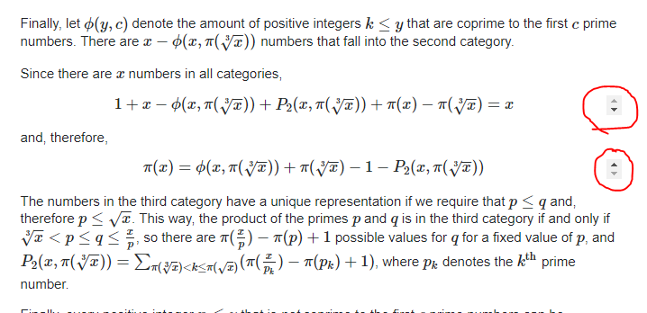
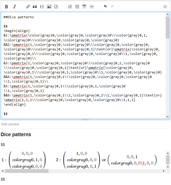
Scrollbars appear to the right of Mathjax $$-style blocks

Scrollbar next to Mathjax block
Image taken from How much is my dice matrix worth?.

DJMcMayhem's worse situation

Image taken from Calculate the number of primes up to n and provided by DJMcMayhem.

This happens at least on the Chrome browser for Windows.

\$\endgroup\$
7
  • 26
    \$\begingroup\$ +1, excellent freehand. \$\endgroup\$
    – DJMcMayhem Mod
    Commented Aug 3, 2018 at 19:31
  • \$\begingroup\$ I'm using Firefox for Linux. I see the scrollbars in the first link but not in the second. \$\endgroup\$
    – alephalpha
    Commented Aug 4, 2018 at 3:02
  • \$\begingroup\$ Chrome on Linux: I see both scrollbars. Firefox on Linux: Just first \$\endgroup\$
    – isaacg
    Commented Aug 4, 2018 at 5:59
  • 2
    \$\begingroup\$ This seems to be caused by the overflow-x: auto rule on the element. Removing it removes the scrollbars. It's odd that an overflow-x rule would cause vertical scrollbars... \$\endgroup\$
    – user45941
    Commented Aug 4, 2018 at 19:45
  • \$\begingroup\$ @Mego That one less pixel though... :P \$\endgroup\$ Commented Aug 4, 2018 at 19:46
  • \$\begingroup\$ Edge on Windows: Only the first scrollbar is visible. \$\endgroup\$ Commented Aug 6, 2018 at 14:09
  • \$\begingroup\$ This should be fixed and will go live in a build or two. \$\endgroup\$
    – Aaron Shekey StaffMod
    Commented Aug 10, 2018 at 19:20
23
\$\begingroup\$

Badge icons are missing

On the Main site:

PPCG badges missing

On Meta:

PPCG meta badges missing

\$\endgroup\$
5
  • 10
    \$\begingroup\$ I can repro this. \$\endgroup\$ Commented Aug 9, 2018 at 20:02
  • 4
    \$\begingroup\$ To be clear, they're gone everywhere, not just on the top bar. They're also gone in the questionsand answers. \$\endgroup\$
    – isaacg
    Commented Aug 9, 2018 at 22:29
  • 1
    \$\begingroup\$ This is specific to this site. Other sites still work fine. \$\endgroup\$
    – user202729
    Commented Aug 10, 2018 at 2:53
  • 1
    \$\begingroup\$ They should be coming from cdn.sstatic.net/Sites/codegolf/Img/sprites.svg?v=da39a3ee5e6b but it's an empty document \$\endgroup\$ Commented Aug 10, 2018 at 12:15
  • \$\begingroup\$ This has been addressed and will go out in the next build. \$\endgroup\$
    – Aaron Shekey StaffMod
    Commented Aug 10, 2018 at 21:32
21
\$\begingroup\$

I've logged a bug for this, but it is unrelated to the theme change.

If many tags are added to a question, tags scroll away and never come back

If too many tags are added to a question to fit in the tag box, the tags start moving away to the left, rendering them unreachable:

enter image description here

Moreover, if the visible tags are deleted, the tags that moved away to the left don't come back:

enter image description here

Similar problems exist with resizing the window while adding tags - it's easy to end up in a state where you can barely see any tags, even though there's plenty of room.

If you delete the last visible tag, the rest do finally scroll back, but it should scroll back long before that.

\$\endgroup\$
16
\$\begingroup\$

Meta site colors low contrast

enter image description here

The meta label on the meta site has very low contrast which makes it difficult to read in glare or for those who have harder time seeing low-contrast text. Also it feels unnatural with "meta" being so close to the other text, not sure if by design but 16px seems to make everything feel more natural.

\$\endgroup\$
2
  • 2
    \$\begingroup\$ This has been fixed and will go out in the next build. \$\endgroup\$
    – Aaron Shekey StaffMod
    Commented Aug 10, 2018 at 16:42
  • \$\begingroup\$ @AaronShekey the contrast is much better indeed. \$\endgroup\$
    – JayCe
    Commented Aug 14, 2018 at 1:46
16
\$\begingroup\$

Search bar font shrinks unnecessarily

As I shrink the horizontal width of the window, when the right navigation bar is removed the font size of the text in the search bar changes abruptly, without the size of the search box itself changing. It goes from this:

enter image description here

To this:

enter image description here

and as far as I can tell there's no reason for the font size to change at all, because the search box size isn't changing.

\$\endgroup\$
14
\$\begingroup\$

we are working on updating all the right side bar elements to use Stacks, our new design system

Inconsistent shadows on yellow boxes

This yellow-box has a shadow & radius on the "Write Question" page:

enter image description here

however a similar yellow box does not:

enter image description here

this feels awkward when navigating between the pages as the two similar elements have different styles.

\$\endgroup\$
14
\$\begingroup\$

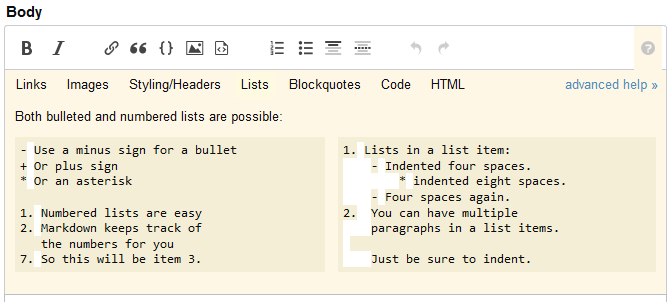
White indentation blocks in the post editor tips

Again, this might be intentional. But even if it is, it gives the feeling that it's a rendering bug -- and doesn't help counting the number of spaces anyway.

white blocks

white blocks

\$\endgroup\$
3
  • 13
    \$\begingroup\$ No freehand circles? :( \$\endgroup\$ Commented Aug 4, 2018 at 5:07
  • 8
    \$\begingroup\$ @EriktheOutgolfer Where I live, freehand circles are ILLEGAL. You may find some on the black market but... shhhhh... I should not even be talking about that. \$\endgroup\$
    – Arnauld
    Commented Aug 4, 2018 at 10:26
  • \$\begingroup\$ Government? Ugh, nevermind, I'm using freehand circles everywhere. :P \$\endgroup\$ Commented Aug 4, 2018 at 10:29
12
\$\begingroup\$

Hiding of left nav is a feature of being signed in.

"Global" left nav hiding does not apply to sites not joined

I have hidden the left nav in my preferences on PPCG. (As I need a large font for my eyes, it is (so far) the only issue with the new theme I've found unacceptable.) This setting is supposed to be global, and indeed seems to work automatically for StackOverflow where I have already joined.

However, it does not work for me on Meta StackExchange - the left nav is still shown there. I assume the difference is that I have never joined that site.

Joining to test... Yep, that was it, now it's gone.

This may be easily fixed for a single site, but I often follow links in Hot Network Questions to sites I don't otherwise use, so I foresee that this would become annoying once the new themes start getting rolled out to all sites.

EDIT: Well, that is a disappointment. I don't generally frequent sites that ask me to register just to make their content bearable to read, which means this will discourage me from visiting other SE sites than those I am already registered at. Note that I am signed in, just not to every single site individually. And those sites still show the top menu bar with my account's notices etc., so it's not like you couldn't somehow get hold of my global preferences.

\$\endgroup\$
2
  • 4
    \$\begingroup\$ It may be worth taking this issue to meta.stackexchange.com. The point you make in your edit is very interesting \$\endgroup\$
    – Beta Decay
    Commented Aug 17, 2018 at 15:54
  • 3
    \$\begingroup\$ ^ I would agree. It seems to me that your point has not yet been fully heard. \$\endgroup\$ Commented Aug 19, 2018 at 4:13
11
\$\begingroup\$

Border-radius on badge progress bar

Is the top-right/bottom-right border radius on the badge progress bar intentional, or is it accidental? It does look weird to me.

(I will however delete this post if it is intentional, as it is not the right place to talk about looks & feels.)

border-radius

\$\endgroup\$
2
  • 2
    \$\begingroup\$ Looks weird to me too. \$\endgroup\$
    – 3D1T0R
    Commented Aug 3, 2018 at 21:59
  • 8
    \$\begingroup\$ I would say it's intentional so it fits the contour of the right side when the progress is 100% \$\endgroup\$ Commented Aug 4, 2018 at 20:18
9
\$\begingroup\$

Tags search page is missing distinguishing features

Tag synonyms are indistinguishable from tags with no usage guidelines and 0-1 answers. Moreover, tags with 0 answers are indistinguishable from tags with 1 answer. On this page, compare , and . is a synonym for the very popular tag . has no questions at all, which raises the question of why it's on the search page at all. And was just created, and so has 1 question and no usage guidelines.

Also, on any tags with no usage guidelines, the "n asked this year" information is missing. For instance, on page 2, has had 2 questions asked this year, but that information is not displayed.

\$\endgroup\$
8
\$\begingroup\$

I have poor eyesight, and as a result I browse Stack Exchange sites at 150% zoom level in Chrome. On most sites, I see the main content to the left, and to the right is useful stuff such as related questions, "featured on meta" and the hot network questions.

In this new theme, because of my zoom level, all that stuff is pushed to the bottom of the page. This seems to be for the sake of fitting the sidebar onto my screen, but (at least currently) its content is vastly less useful than the right-hand column that it's displacing. It would be much better for the sidebar to disappear before the right-hand column does.

\$\endgroup\$
4
  • \$\begingroup\$ Feel free to go to preferences and hide the left nav. That should improve the situation for you. Please let me know if it doesn't. \$\endgroup\$
    – Joe Friend Staff
    Commented Aug 7, 2018 at 15:12
  • 1
    \$\begingroup\$ Neat, thanks, I never would have guessed that was there. (Which in itself is a possible issue, though a more minor one.) \$\endgroup\$
    – N. Virgo
    Commented Aug 8, 2018 at 2:24
  • \$\begingroup\$ Nice - I just assumed we'd have to RIP it for every site individually (oh, turns out that the preferences are per-site - RIP is likely easier...) \$\endgroup\$ Commented Aug 8, 2018 at 8:08
  • \$\begingroup\$ @TobySpeight The preference to unpin the left nav is a global preference that applies to all sites with the new unified theme. \$\endgroup\$
    – Joe Friend Staff
    Commented Aug 15, 2018 at 16:28
7
\$\begingroup\$

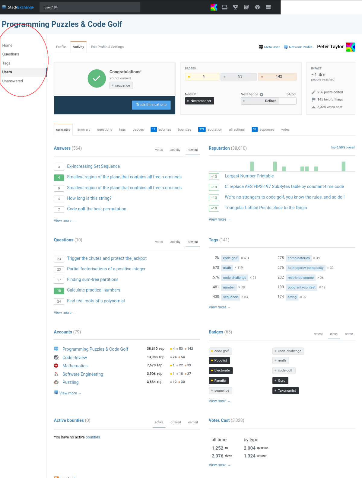
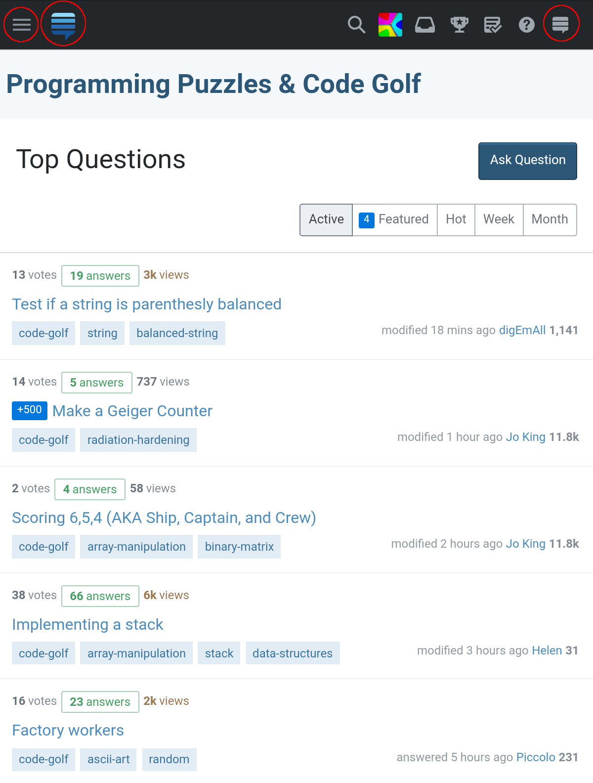
This is a temporary artifact due to responsive NOT being ready for all pages. So, on a smaller viewport (like a tablet) the left nav will auto hide on some pages (responsive ones) but not others (non-responsive ones). This will be fully addressed when we make all pages responsive, but that will take some time.

There is a curious inconsistency whereby on my tablet the left navigation shows on some pages (e.g. my user page) but not on others (e.g. the homepage).

User page: note the left navigation:

My user page

Home page: note the absence of left navigation:

Homepage

This leaves the homepage apparently with less functionality than it had in the previous design. It turns out that it's still possible to e.g. list questions by criteria other than "Top", but it requires finding which of three "hamburger" icons (circled in screenshot above) opens the menu with that functionality, which I do not consider good discoverability.

I regard this as a removal of useful functionality: previously it took one click to get to a list of questions sorted by Newest, but now it takes at least two, and one of them is not discoverable.

\$\endgroup\$
8
  • \$\begingroup\$ Peter, not sure I understand your issues. Could you give some more details with pictures and freehand circles? \$\endgroup\$
    – Joe Friend Staff
    Commented Aug 8, 2018 at 0:22
  • \$\begingroup\$ I have attempted to do so (although I don't do freehand circles: since the GIMP supports non-freehand ones I can't be bothered to buy a graphics tablet), but imgur seems to be having problems at present. If it's not fixed by this evening, I'll reupload the images to my own server. \$\endgroup\$ Commented Aug 8, 2018 at 6:35
  • 7
    \$\begingroup\$ @PeterTaylor I don't think you understand the point of freehand circles, they're supposed to be drawn by mouse or touchpad, not tablet. \$\endgroup\$
    – Pavel
    Commented Aug 9, 2018 at 2:13
  • \$\begingroup\$ @PeterTaylor LOL freehand circles are a network-wide tradition. Also, yeah, those imgur.stack issues are slowly driving me nuts. \$\endgroup\$ Commented Aug 9, 2018 at 14:06
  • \$\begingroup\$ Note that profile page shows the desktop version, that doesn't seem to be problem with the bar itself. \$\endgroup\$
    – RedClover
    Commented Aug 10, 2018 at 7:37
  • \$\begingroup\$ @Soaku, there isn't "a" desktop version. It seems that some pages are responsive (the layout depends on your browser window size) but others are not, which means that the UX is rather poor at some sizes, including the size which my tablet imposes. \$\endgroup\$ Commented Aug 10, 2018 at 7:49
  • 1
    \$\begingroup\$ @Pavel, if you are able to use a device which is manifestly not designed for circular movements to produce a circle then good for you. I am not. \$\endgroup\$ Commented Aug 10, 2018 at 7:51
  • \$\begingroup\$ @PeterTaylor The profile page on your screenshot looks like if it was of bad resolution \$\endgroup\$
    – RedClover
    Commented Aug 10, 2018 at 7:53
6
\$\begingroup\$

Fixing existing MathJax issues is out of scope for the themes work.

MathJax delimiters and linefeeds issue

I'm not sure whether this bug was introduced with the new version, but I noticed that adding linefeeds after or before MathJax delimiters breaks the rendering, at least while editing. (See this revision for the correct rendering without any linefeed.)

Broken MathJax

\$\endgroup\$
1
  • 5
    \$\begingroup\$ This has been the case for years on other stacks which have had MathJax for longer than we have. \$\endgroup\$ Commented Aug 3, 2018 at 21:29
6
\$\begingroup\$

Welcome to Stack Overflow, sign up to our newsletter!

SO icon next to envelope

\$\endgroup\$
2
5
\$\begingroup\$

Order questions keyboard shortcut doesn't do anything

G Q goes to https://codegolf.stackexchange.com/questions as usual.

After that, however, O A does not "sort by active". ? offers no option to "order questions" at all.

\$\endgroup\$
2
  • \$\begingroup\$ This will be fixed in the next build (tomorrow). There problems were that (1) the containing div lost its id="tabs" and needed a new selector and (2) tabs that got collapsed to "More" didn't have a data-shortcut attribute and didn't match the > a selector. \$\endgroup\$
    – Brian Nickel Staff
    Commented Aug 14, 2018 at 22:42
  • \$\begingroup\$ This doesn't fix things for users who've opted into the Custom Question Lists alpha, but I created a task to fix that in Phase 2. \$\endgroup\$
    – Brian Nickel Staff
    Commented Aug 14, 2018 at 22:44
5
\$\begingroup\$

Currently we still recommend you use the mobile view on small screen devices. There is a good bit of work for us to do to make the responsive pages work well on mobile. That work is planned but we don't have a firm schedule at this time.

The Unanswered tab is partially hidden when loading the page on mobile devices

Freehand red circles FTW!

Unanswered tab partially hidden on mobile

\$\endgroup\$
4
\$\begingroup\$

Left bar whitespace right of text doesn't go away

As I shrink the horizontal window size, various page elements are removed. However, at no point is the whitespace to the right of the left navigation text removed, up until the point where the left navigation bar is removed.

\$\endgroup\$
4
\$\begingroup\$

Currently we still recommend you use the mobile view on small screen devices. There is a good bit of work for us to do to make the responsive pages work well on mobile. That work is planned but we don't have a firm schedule at this time.

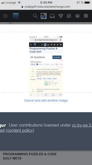
The insert image dialog box cannot be scrolled on mobile

The pop-up that appears when trying to upload an image cannot be scrolled, and you cannot actually insert the picture into the post.

enter image description here

\$\endgroup\$
0
3
\$\begingroup\$

Misleading mouse cursor over the 'Next badge' element

Although the 'Next badge' element is clickable, the mouse cursor is set to either default or text.

All other badge elements set the mouse cursor to pointer when hovered over.

enter image description here

\$\endgroup\$
1
  • 1
    \$\begingroup\$ This isn't related to theming. \$\endgroup\$
    – Joe Friend Staff
    Commented Aug 14, 2018 at 17:27
2
\$\begingroup\$

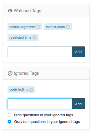
Watched and Ignored tags can both be open at once

I'm not sure if this is a bug or not, feel free to ignore if it's intended.

There's the watched tags and ignored tags. If you click the edit button, you can add or remove tags. If you click anywhere else, the ability to edit goes away.

However, if you click on the edit button of the other one (watched and ignored) then the first remains editable. This seems inconsistent and surprising.

Here's what it looks like:

enter image description here

\$\endgroup\$
1
  • \$\begingroup\$ Same behavior if you currently don't have any watched tag or ignored tag and click on Watch a tag or Add an ignored tag, respectively. Also, I'm not sure it's a good idea to remove the Edit buttons in that case. I think they should always be there and be equivalent to the Add buttons when the lists are empty. \$\endgroup\$
    – Arnauld
    Commented Aug 4, 2018 at 13:06
2
\$\begingroup\$

Direct link to an answer misaligns the top of the answer second time

(now posted to the main MSE question instead)

\$\endgroup\$
0
-2
\$\begingroup\$

Tag buttons in chat focus and unfocus indefinitely

I've only noticed this in PPCG chat rooms so far, but if you hover over a question tag on the bottom most pixel, the entire tag button focuses and unfocuses forever.

Example message

\$\endgroup\$
2
  • 1
    \$\begingroup\$ We haven't made any changes to chat that I'm aware of, so this isn't related to the issue of the new theme. \$\endgroup\$
    – Joe Friend Staff
    Commented Aug 8, 2018 at 14:29
  • \$\begingroup\$ This already happened before the new design. status-declined. \$\endgroup\$
    – user202729
    Commented Aug 10, 2018 at 2:55

You must log in to answer this question.

Not the answer you're looking for? Browse other questions tagged .