While line-height: 1 does tend to look pretty tight for normal source code, something like:
pre { line-height: 1.1 }
or:
pre { line-height: 1.2 }
ought to strike a pretty good compromise between code and ASCII art readability. Thus, I would support (and, indeed, was just about to post a request for) adding this style to our CSS site-wide.
Examples:
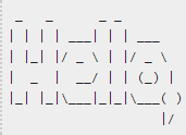
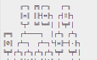
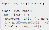
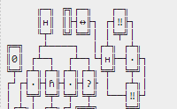
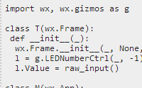
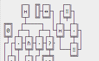
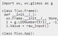
To evaluate the effects of this proposal, I took a couple of more or less representative screenshots of both ASCII art and code at various line-height settings. All these screenshots are taken using Chrome 32 on Windows 7. The ASCII art examples are from here and here, while the code is from here:
Line-height: 1.4 (current):
Line-height: 1.2 (proposed):

Line-height: 1.1 (alt. proposal):

Line-height: 1.0 (comparison):

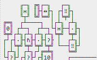
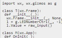
Based on this quick test, it appears that line-height: 1.1 is close to optimal for ASCII art; at line-height: 1 the line-drawing characters in the second example actually start to overlap a bit. Both 1.1 and 1.2 do look reasonably readable for both ASCII art and code, whereas the current line-height: 1.4 looks absolutely awful for ASCII art, yet not much (if at all) better than 1.2 for code.
Besides, keep in mind that the code sample above isn't really all that representative — a large proportion of the code on this site looks more like this:
,;._1'A',' _|\/A()V`,'''{~+/;._1]0,,(6$2)#:-&40]3 u:'8H1(((((H:f[4ZS4ZP2(RPMAMANf[>CZD[F;I[OVFF;TgfS5aGd[7T9JW4[eG[+Of7ddg?d[.AfT]WUASE=S>bSdgI]cS[RWBYSE?gSeG_X(()WG('
With code like that, line-height doesn't really make any difference to its readability (which some might argue to be zero, in any case).
Edit: This fix is now included in the SOUP user script as of v1.14. The line height I went with is 1.15, which seems to offer the optimal compromise between ASCII art and code readability.


$("pre").css("line-height", 1)\$\endgroup\$$(.post-taglist a[href="/questions/tagged/ascii-art"]).length && $("pre").css("line-height, 1")\$\endgroup\$