64
\$\begingroup\$

The long wait is almost over!

You have been eminently patient while we've gotten other site designs finished and then completely redesigned the layout of the network. Now that all of that heavy lifting is complete, we're working on designs for our graduated sites that are still in the beta theme and you're up next!

Over the next few weeks we'll be going through the following process:

  1. Collect ideas from y'all about what you'd like this site to look like (that's what this post is for) See below for more info
  2. Create a design & release it and get feedback from y'all. We'll make the site live and post an announcement on meta where you can give feedback.
  3. Make adjustments We hope that you love the design we built in the prior phase but we expect some minor adjustments may be necessary.

Phase 1 - Collecting Ideas

You have until 17 April to submit ideas for your site design.

It looks like y'all have been really excited about the possibility of a site design for a while and even have a userscript to change the site appearance. I see that discussion was almost three years ago. We'll be looking those ideas over in addition but if you have new ideas or if there are specific standout ideas on that discussion that you'd like to mention again, please add them as answers here.

We're excited to revisit this process with you and I'll be here to answer any questions you have. While I'm not a designer. I've been working with site themes for many months now so I have lots of the answers and, if I don't, I know who to reach out to.

As I mentioned, the sites have gone through a big redesign since you graduated, so there are some limitations to what we can do for you but there's still a lot we can customize. If you're interested in seeing what you can expect to be customized, there's a detailed outline on Meta Stack Exchange here.

We need your help creating a gallery of concepts for Lisa to work from to create your design. Don't worry if you're not artistic or able to come up with beautifully rendered examples. You're the experts in your site and how to exemplify your subject's identity and we need your help if we want your site to fit you.

That could be symbols or a color palette or example images - things that you think really capture some of the personality of the community or define PPCG so that when new users come here, they'll immediately know they're in the right place. It can also be helpful to know what you specifically wouldn't want in some cases - I see you mention not wanting anything golf-related on the other post, for example.

Lisa's a really talented designer, so even if what you send our way looks like the drawings my two-year-old brings home from school, she's well-equipped to interpret that and create a beautiful, representative design we hope you'll love.

Design-wise, that's all I've got for you. Don't hesitate to ask if you have any questions either about the process or what we'll be customizing, feel free to ask in comments. Don't forget the 17 April deadline. We'll be back a week or two after it with more information and maybe even your design!

Reputation Levels

Oh... you're still here? I wanted to take a minute to talk about rep levels, which you may remember are tied to the design release.

Y'all have plenty of active, high reputation users (and have been begging for the higher reputation levels), so we'll also be raising your reputation levels once the design is complete. This means that some of you may lose privileges you currently have as we do not grandfather users in. To see more information about this and what the reputation levels will change to, please see the Meta Stack Exchange FAQ: Reputation requirements compared.

Oh, Who am I?

If you don't know me, I'm one of the Community Managers here at Stack Exchange. I'm here to listen to your input and convey it to our designer, Lisa, so that she can start working on your site design.

Update:

Thanks so much for your input. We're looking it over and will start working on your design.

I do want to say a couple of things, though. I've really enjoyed seeing the neat ideas y'all have for changing this site and I'm really sorry to have to clarify... when I say "site design" I mean what some sites call a "skin". This change won't be impacting the functionality or positioning of where the elements on the page are here.

If you have requests for this sort of thing, you can create a Feature Request post here on PPCG Meta - or link me to one if it already exists, but they won't be considered as part of this work. I'm sorry.

\$\endgroup\$
13
  • 36
    \$\begingroup\$ Wait, is this real life? Someone pinch me... :D \$\endgroup\$
    – DJMcMayhem Mod
    Commented Apr 10, 2019 at 4:03
  • \$\begingroup\$ To confirm, this is for questions about the design specifically, not other requests like the ones here? \$\endgroup\$
    – Riker
    Commented Apr 10, 2019 at 4:32
  • 1
    \$\begingroup\$ @Rɪᴋᴇʀ This is all about artwork/design and a tiny bit about privileges... which will be the defaults - so, yes. There's certainly a lot of things we could do to help y'all out... and I'm sure Puzzling could benefit from some of those changes, too... and possibly other sites... and we'll be looking into community initiatives. Juan talks about it some here: meta.stackexchange.com/questions/312699/… \$\endgroup\$
    – Catija StaffMod
    Commented Apr 10, 2019 at 4:33
  • \$\begingroup\$ @Catija Thanks, I just wanted to make sure. \$\endgroup\$
    – Riker
    Commented Apr 10, 2019 at 4:41
  • 6
    \$\begingroup\$ Will specific reputation levels still be adjustable? (I ask because it'd be ideal if the "participate on meta" privilege could remain at 1 reputation, since the sandbox system relies on it.) \$\endgroup\$
    – Doorknob Mod
    Commented Apr 10, 2019 at 5:04
  • 2
    \$\begingroup\$ @Doorknob We don't have any plans to change that. :) \$\endgroup\$
    – Catija StaffMod
    Commented Apr 10, 2019 at 5:05
  • 10
    \$\begingroup\$ I dare you to make it a dark theme \$\endgroup\$
    – Jo King Mod
    Commented Apr 10, 2019 at 5:15
  • 7
    \$\begingroup\$ You are 9 days late for April fools! \$\endgroup\$
    – Fatalize
    Commented Apr 10, 2019 at 6:47
  • 2
    \$\begingroup\$ Also, what about them goodies? \$\endgroup\$
    – Fatalize
    Commented Apr 10, 2019 at 6:51
  • 20
    \$\begingroup\$ As a general comment: please make sure the default answer format (#Language, 123 bytes \n [code] \n [Try it online](link)) looks good. \$\endgroup\$
    – Sanchises
    Commented Apr 10, 2019 at 7:32
  • 1
    \$\begingroup\$ To be fair, we didn't beg for raised privilege levels. We were approached by a CM about the possibility, and we put it to a meta vote a year ago (which passed). \$\endgroup\$
    – user45941
    Commented Apr 12, 2019 at 3:52
  • 1
    \$\begingroup\$ @Catija Here's our meta thread of feature requests for functional changes, since you asked for a link. Some of them have been spun off into their own meta threads. \$\endgroup\$
    – xnor
    Commented Apr 24, 2019 at 22:43
  • 1
    \$\begingroup\$ @Catija Based on your not about design vs functionality changes, and on many of the popular (relevant) answers here, I've added a more concrete suggestion. I hope it isn't too late. \$\endgroup\$
    – Adám
    Commented Apr 25, 2019 at 9:49

13 Answers 13

53
\$\begingroup\$

Nothing in the design related to Golf

Not a design idea but rather an anti-idea.

Let me repost one very popular answer about our old graduation design ideas question: "no relation to the sport golf" by Maltysen.

I'm not sure what design I want for PPCG, but I sure don't want anything related to Golf in that design.

\$\endgroup\$
6
  • 2
    \$\begingroup\$ I see the "graduation userscript"'s green theme as alluding to the golf green. \$\endgroup\$
    – Adám
    Commented Apr 10, 2019 at 7:05
  • 4
    \$\begingroup\$ @Adám I think most people liked green because it makes he site look different from other blueish SE sites, as mentionned here. \$\endgroup\$
    – Fatalize
    Commented Apr 10, 2019 at 7:15
  • 20
    \$\begingroup\$ If you really want something different, I don't think there are any pink sites. \$\endgroup\$
    – Catija StaffMod
    Commented Apr 10, 2019 at 21:46
  • 14
    \$\begingroup\$ From now on, our name shall be "Pink Programming and Code Games" \$\endgroup\$
    – Jo King Mod
    Commented Apr 11, 2019 at 6:09
  • 3
    \$\begingroup\$ @Catija Hehe, I'm already seeing a very ugly version of PPCG with pink background, purple text and something weird like orange or lime code-text. xD Perhaps something for April Fool's Day? ;p In all seriousness though: green would be fine. \$\endgroup\$ Commented Apr 11, 2019 at 8:49
  • 11
    \$\begingroup\$ It's probably best to ignore all comments about colour. If someone has an opinion they're willing to stand behind, let them post it as an answer so it can be voted upon. \$\endgroup\$ Commented Apr 11, 2019 at 13:09
52
\$\begingroup\$

Better, and served, monospace font

Yes, I know this isn't on the list of currently modifiable features, but I really think that this is the single most important design issue that is very easy to fix.

The current monospace font stack is:

font-family:
Consolas,
Menlo,
Monaco,
Lucida Console,
Liberation Mono,
DejaVu Sans Mono,
Bitstream Vera Sans Mono,
Courier New,
monospace,
sans-serif;

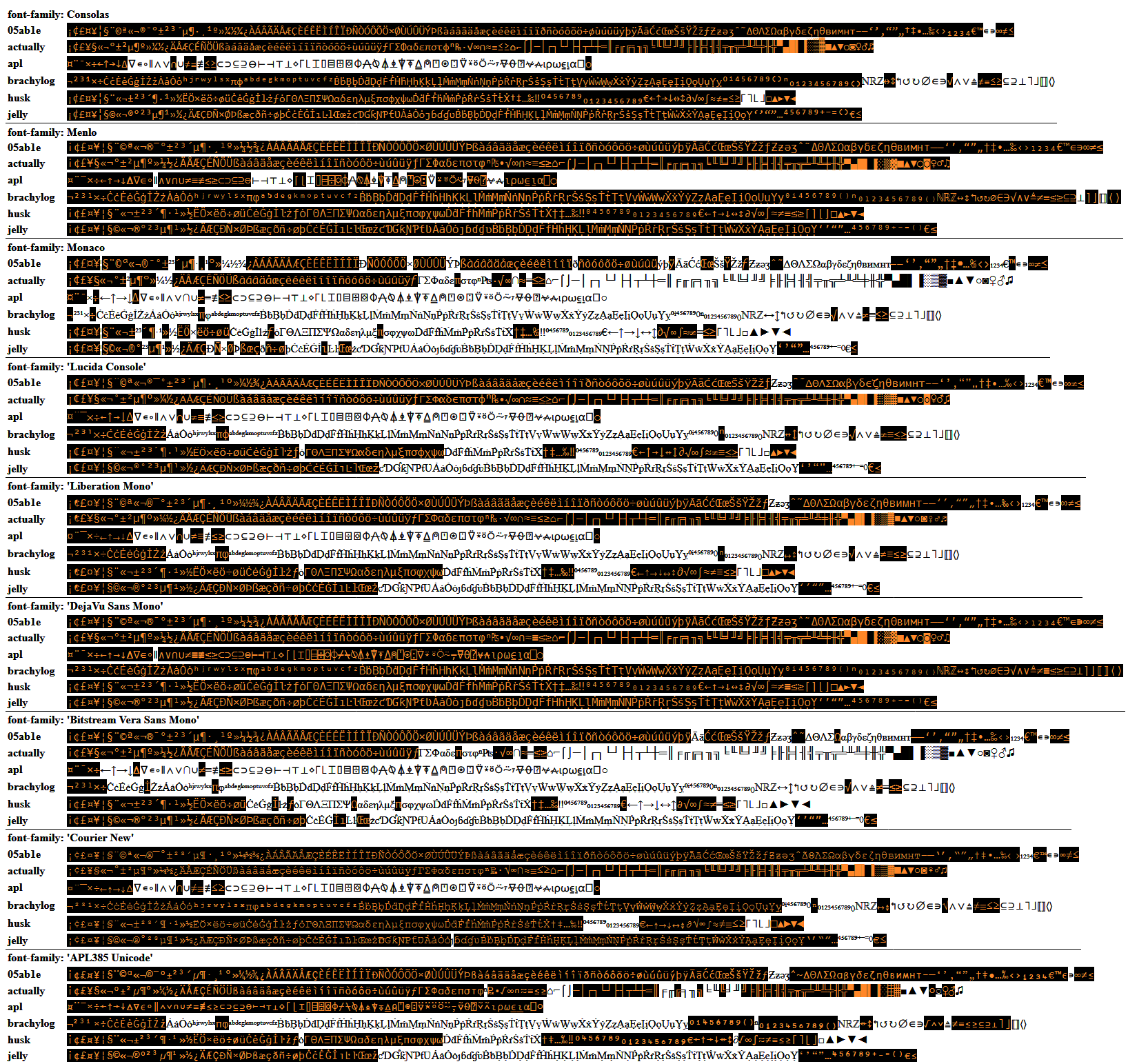
A quick glance at our site's content will show that non-ASCII programming languages are very frequent here, some of them maybe even as frequently used here as the mainstream languages are "out there". This means that good support for non-ASCII monospace text is essential. Unfortunately, the first five entries in the stack are not very good, and no fonts are hosted by Stack Exchange as fallbacks if the user does not have any of the listed fonts.

As the Microsoft Edge browser becomes yet another Chromium browser, it becomes even more important that a good font is available, because Chromium's Blink rendering engine prefers a consistent look over glyph fidelity. This means that if a font is missing a character, Blink will rather use Unicode combining characters to attempt to overlay characters that together look like the needed symbol, rather than searching up the font stack for a font that has the composite symbol. If you see as similar to ≡/ rather than \$≢\$ then your browser has this issue.

I suggest that DejaVu Sans Mono be moved up to the very top of the stack, and that it is served by the server (with @font-face) when not present locally. It is the only one of the listed fonts with a very wide repertoire of characters.

I'd personally take this even if it meant forgoing all other site-specific design tweaks, but in fact, that particular font does have a close relationship with the site: It is extremely common for answers to link to Try it online, a site which forces DejaVu Sans Mono for all code. If you had the display issue mentioned above, check out how nicely it renders in Try it online! Note that Try it online is run by one of our moderators, and that much of the content there (dedicated code golfing languages) was created and submitted by PPCGers. So Try it online and PPCG are very closely knit together. In fact, a good percentage of our members would probably be pretty happy if PPCG's design resembled that of Try it online

Comparison of fonts

Below is a comparison of how complete the various fonts are when it comes to the non-ASCII characters in six popular programming languages on PPCG. Characters that are included in a font are highlighted in orange on black (dark version with included characters in blue on white). APL385 Unicode has been added for completeness. Font rendering comparison in Firefox 66 on Windows

\$\endgroup\$
16
  • 10
    \$\begingroup\$ Upvoted; I chose all glyphs in my language Brachylog based on what was available in DejaVu Sans Mono. \$\endgroup\$
    – Fatalize
    Commented Apr 10, 2019 at 6:53
  • 1
    \$\begingroup\$ 𝐬 seems to be a problem even for DejaVu Sans Mono, and there are probably some other weird characters like it, so it could be worth thinking about how to force complete monospacing when even font choice fails. \$\endgroup\$ Commented Apr 10, 2019 at 8:23
  • 1
    \$\begingroup\$ @UnrelatedString Is 𝐬 used in any known programming language? I can't think of any other way to enforce monospacing than something like lettering.js, which I'm pretty sure SE won't use. \$\endgroup\$
    – Adám
    Commented Apr 10, 2019 at 9:31
  • \$\begingroup\$ Brought it up because it happened to be in the single solution I've written in Neim. Hopefully there aren't any other languages that include it. \$\endgroup\$ Commented Apr 10, 2019 at 9:33
  • 1
    \$\begingroup\$ @UnrelatedString Neim has severe problems in DejaVu Sans Mono. That's the exception rather than the rule. \$\endgroup\$
    – Adám
    Commented Apr 10, 2019 at 9:46
  • \$\begingroup\$ Charcoal also has severe problems :P \$\endgroup\$
    – ASCII-only
    Commented Apr 12, 2019 at 6:05
  • 1
    \$\begingroup\$ @ASCII-only Are there any monospace fonts that support the entire Charcoal codepage? \$\endgroup\$
    – Adám
    Commented Apr 12, 2019 at 6:22
  • 1
    \$\begingroup\$ @UnrelatedString Are there any monospace fonts that support the entire Neim codepage? \$\endgroup\$
    – Adám
    Commented Apr 12, 2019 at 6:23
  • 2
    \$\begingroup\$ @Adám Nope - the fancy fullwidth capitals being the main issue there. The only one that comes close is GNU Unifont, which was not intended to look anywhere near good - just readable \$\endgroup\$
    – ASCII-only
    Commented Apr 12, 2019 at 6:30
  • 1
    \$\begingroup\$ I don't have DejaVu Sans Mono on my machine, but I do have Menlo, which is, according to Wikipedia, based on Bitstream Vera and DejaVu. It works fairly well on the Tony the Pony test. I don't think forcing a download of a font is very polite if there's a good chance a related font is already available. Shuffling the stack seems like a more reasonable choice. \$\endgroup\$
    – Jon Ericson StaffMod
    Commented Apr 17, 2019 at 23:41
  • 1
    \$\begingroup\$ @JonEricson Re "forcing a download of a font": If I am correct, the jquery.min.js file is 33.5KB while a font file (on TIO) is only about 46KB, so it's not very heavy. \$\endgroup\$
    – user202729
    Commented Apr 19, 2019 at 15:36
  • \$\begingroup\$ @user202729: True. The difference, however, is most people will already have a copy of jquery.min.js cached in the browser and we use the copy served by Google, which is fast and reliable. The advantage of moving fonts within the font-family declaration is that we can get "good enough" fonts without pushing any extra data at all. (Of course, "good enough" is often a matter of opinion. ;-) \$\endgroup\$
    – Jon Ericson StaffMod
    Commented Apr 19, 2019 at 17:25
  • 1
    \$\begingroup\$ I'm sorry but at this point in time, changing the font stack is out of scope. It's set globally and we generally don't want to have special font stacks for each site. There's some related discussion about how our font stacks work on MSE. \$\endgroup\$
    – Catija StaffMod
    Commented Apr 22, 2019 at 22:07
  • 7
    \$\begingroup\$ @Catija Even on SO, I actually hesitate to use out of fear that it renders as ≡/ (with a very different meaning) instead of \$≢\$ when giving answers in APL, even when that would otherwise be the best practice, so I wouldn't mind a reshuffle of the font stack for all of SE to have DejaVu Sans Mono,Menlo at the top, since these two fonts have best coverage. And it isn't just for APL — people sometimes use backticks as quotes for things like IPA, where again DejaVu Sans Mono has best coverage. \$\endgroup\$
    – Adám
    Commented Apr 23, 2019 at 10:01
  • 2
    \$\begingroup\$ @Adám If you can make a strong argument for that, please feel free to post it on MSE but do take Jon's post I linked to into account. We pretty strongly weight our stack based on what fonts people are likely to already have on their systems because we're looking to be lightweight and not require font downloads. We'd probably be more likely to use Menlo since that's higher up the stack, though and it addresses this specific concern you have. \$\endgroup\$
    – Catija StaffMod
    Commented Apr 23, 2019 at 15:27
36
\$\begingroup\$

Text content should suggest competition as much as possible

PPCG is a competitive site, not a question and answer site. All Stack Exchange Tour pages say

We're a little bit different from other sites.

I've always understood this as referring to the other Stack Exchange sites. Although I realise now that it may actually not be the intent, we are actually a little bit different from all the other Stack Exchange sites.

Text should be adapted, mainly to replace the terms questions/answers with challenges/solutions. This has already been done in one place on the Tour page, but the main page says Top Questions title and has Ask Question, Post Your Answer buttons etc. that should instead read Top Challenges, Post Challenge, Post Your Solution etc. and the Tour page needs a bit more tweaking:

Programming Puzzles & Code Golf is a challenge and solve site for programming puzzle enthusiasts and code golfers. It's built and run by you as part of the Stack Exchange network of Q&A sites. With your help, we're working together to build a library of programming puzzles and their solutions.

We're quite different from other sites. Here's how:

Post challenges, see clever solutions, be distracted

This site is all about posting and solving programming challenges. It's not a discussion forum. There's no chit-chat.

\$\endgroup\$
5
  • 2
    \$\begingroup\$ The issue here is that there is actually an on-topic form of Q&A, tips. \$\endgroup\$ Commented Apr 10, 2019 at 19:38
  • 5
    \$\begingroup\$ @EriktheOutgolfer Yes, I thought about that, but those questions are relatively rare, and newcomers to the site are even more unlikely to ask such questions. The Get answers to practical, detailed questions section should of course include tips being on-topic. \$\endgroup\$
    – Adám
    Commented Apr 10, 2019 at 20:02
  • 2
    \$\begingroup\$ Less emphasis on accepted answers would help with this \$\endgroup\$
    – Jo King Mod
    Commented Apr 11, 2019 at 10:18
  • 3
    \$\begingroup\$ Ahem, "no distractions"? \$\endgroup\$
    – Luis Mendo
    Commented Apr 11, 2019 at 13:49
  • \$\begingroup\$ @LuisMendo Fixed. \$\endgroup\$
    – Adám
    Commented Apr 11, 2019 at 15:05
36
\$\begingroup\$

Links to sandbox

The sandbox is a meta thread which is intended to help people get feedback on draft questions and so reduce closures, arguments, and other friction on the main site. It's been successful enough that other stacks have copied it. Its biggest problem is channelling new users there. Currently we have:

  1. It's a meta-question. This requires the diamond mods to retag it regularly, because being auto-expires.
  2. There's a popular (second most popular at +26/-0 behind first place on +33/-0) community ad for it.
  3. There's a link from the on-topic help page.
  4. Failing that, it's common to leave comments directing new users to it.

There are two design changes which would help:

  1. In the "Ask a question" page, add a link to the page. Suggested text:

    It's worth polishing your question in the sandbox if you haven't already done so.

  2. Add a link in the right column, above or below the "Featured on meta" panel. This could perhaps use some imagery (inspired by the community ad?) in addition to text. Then the mods could remove the tag, because the new link would be a more eye-catching replacement.
\$\endgroup\$
2
  • 2
    \$\begingroup\$ The easiest option for #2 would be something placed similar to the disclaimers on Mi Yodeya and Christianity... though it's quite a different usage for them, so we'd have to discuss. \$\endgroup\$
    – Catija StaffMod
    Commented Apr 15, 2019 at 16:34
  • 9
    \$\begingroup\$ Ideally, new users will be funneled towards the sandbox page as much as they are currently funneled towards the (hopefully renamed) "ask a question" page. \$\endgroup\$
    – PhiNotPi
    Commented Apr 17, 2019 at 16:49
29
\$\begingroup\$

Incorporate Conway's Game of Life somewhere

Game of Life (GOL) is A) Very much in the spirit of this site. It's a mathematical curiosity that only exists for the entertainment of people who like spending their time thinking about math and programming. And B) PPCG has a long history of being fascinated by GOL. Arguably, the most notable challenge of all time on this site was Quest for Tetris. And of course, there was also The Digital Clock built in GOL, which is a smaller project, but arguably more impressive, as it was done by a single user.

I don't think the theme should be dominated by GOL. But a little reference somewhere, perhaps in the footer, would be great. A glider is probably the most famous GOL emblem, but I think something like an R-pentomino captures the spirit of the site much better. It's a really small and simple construction (like a code-golf snippet) that takes a very long time before stabilizing (even though it appears simple/short, it accomplishes a lot).

\$\endgroup\$
3
  • 23
    \$\begingroup\$ Also, the R-pentomino perfectly captures the PPCG spirit of "this will take longer than the lifetime of the universe to terminate, but I saved a byte". \$\endgroup\$
    – user45941
    Commented Apr 13, 2019 at 16:39
  • \$\begingroup\$ ... That's very clearly an F pentomino ;) \$\endgroup\$
    – Catija StaffMod
    Commented Apr 15, 2019 at 16:15
  • \$\begingroup\$ As per this, how about the very famous GoL in APL? It has some nice patterns: {⊃1 ⍵ ∨.∧ 3 4 = +/ +/ ¯1 0 1 ∘.⊖ ¯1 0 1 ⌽¨ ⊂⍵} The page about it is probably one of only few instances where a commercial entity speaks of code golfing (about 3/4 way down). \$\endgroup\$
    – Adám
    Commented Apr 17, 2019 at 13:48
25
\$\begingroup\$

Distinctive is good

We're pretty unusual for a SE site for being about challenges rather than questions and answers. So, I think it would be good to have a distinctive design that set us apart. I know that every site design is custom and special, but I this think is an opportunity to make something that really stands out.

In particular, it would be good to stylistically distinguish us from the many programming sites where people go for coding help, which hapless newbs seem to keep mistaking us for. Part of the issue is that the SE design screams "Q&A", and has become an iconic template that other Q&A sites have copied. While there's many things we can't change about our site layout and text, maybe a really distinctive visual scheme will make it clear that we're different.

Perhaps we could take visual cues from other coding contest sites such as SPOJ, Codeforces, and CodeChef.

\$\endgroup\$
21
\$\begingroup\$

Feel of code golfing

Here's a "palette" of words to try to convey the feel of code golfing:

Shorten, optimize, remove characters, squeeze, revise, strikethroughs, pare down, cleverness, minimize, efficiency, loopholes, inventiveness, unintended uses

I have no idea how these could be expressed visually, but that's why we have a designer :)

\$\endgroup\$
1
  • 2
    \$\begingroup\$ Also: "Undocumented feature", "Trick", "Exploit", "Cheat", "Code Abuse", "Saved 1 byte!!", "Esolang" \$\endgroup\$
    – roblogic
    Commented May 5, 2019 at 23:16
16
\$\begingroup\$

One unusual characteristic of this site is the prevalence of esoteric programming languages and paradigms. There are three in particular which I think might be appropriate design elements for the site.

The first is APL. It is significant in code golf as having a good claim to be the first language in which people competed at golfing, and it is visually distinctive. I suspect that Adám (the same Adám who has posted a couple of answers to this question) might be able to supply a large chunk of real working code.

The second is Wireworld. (For image searches it may be useful to include the word automaton). This is very visual, very simple (it uses a square grid and four colours, but the logic is really in the wiring so one solid colour and one fully transparent one suffice to convey the essence), and Turing complete. For example, take Ed Pegg's counter. (If you want to ask Ed Pegg for permission to use it, he is active on math.stackexchange.com).

The third is the Penrose tiling. While this is not itself a programming language, it is possible to build Turing complete automata on top of it. It's been used as a design feature in architecture, particularly in CS departments, and is quite recognisable. It conveys structured chaos.

\$\endgroup\$
4
  • 3
    \$\begingroup\$ :P sounds like Funciton could possibly be appropriate as well, and/or possibly Game of Life as is used in the userscript \$\endgroup\$
    – ASCII-only
    Commented Apr 11, 2019 at 5:00
  • 4
    \$\begingroup\$ How about a Brainfuck interpreter golfed in APL? \$\endgroup\$
    – Adám
    Commented Apr 11, 2019 at 21:27
  • 1
    \$\begingroup\$ @Adám, I was thinking in terms of existing code which could be faded in and out so that only an excerpt of it is used. I wouldn't want to volunteer someone else for a big project. Obviously if you want to write something new then that's great, and a BF interpreter would certainly be appropriate. \$\endgroup\$ Commented Apr 12, 2019 at 15:44
  • 1
    \$\begingroup\$ @PeterTaylor The BF interpreter that comes with APL is here but isn't golfed. I was thinking of launching a community project to write a golfed one that is able run the golfed Hello World BF program. \$\endgroup\$
    – Adám
    Commented Apr 12, 2019 at 16:39
8
\$\begingroup\$

Design should suggest competition as much as possible

PPCG is a competitive site, not a question and answer site. All Stack Exchange Tour pages say

We're a little bit different from other sites.

I've always understood this as referring to the other Stack Exchange sites. Although I realise now that it may actually not be the intent, we are actually a little bit different from all the other Stack Exchange sites.

Artwork (banner, icons, etc.) should reflect this as much as possible. Here are some inspirational words:

  • trophies

  • medals

  • podiums

  • measuring tapes

  • flags

  • laurels

  • gold, silver, bronze

Maybe we should even switch to serif font to set us apart from most general programming topic sites like Stack Overflow and Code Review? MathJax is becoming more popular here too, and looks better with surrounding serif body text than sans serif does.

\$\endgroup\$
4
  • 5
    \$\begingroup\$ While I agree with the point of changing the text, I'm don't on this one. We're not the only site that does non questions things.If you look at puzzling, who are a similar type of site to us, their design reflects, well, puzzling. I know that the spirit of PPCG isn't as tangible, but I feel it would be nice to have for the design to be about esoteric/hacky programming, short code, or whatever the community feels PPCG is about. I know, at least for me, PPCG isn't about competition in any serious way. \$\endgroup\$
    – Maltysen
    Commented Apr 10, 2019 at 14:14
  • \$\begingroup\$ @Maltysen Very good point. It is more about "striving" programming than "competitive" programming. Any ideas on how to phrase that better? \$\endgroup\$
    – Adám
    Commented Apr 10, 2019 at 14:40
  • 1
    \$\begingroup\$ I agree, I think such symbology could give new users a visual clue that we're not a Q&A site but a site for challenges, and hopefully prompt them to go elsewhere for programming help. Perhaps external sites like SPOJ could have inspiration for visual elements. \$\endgroup\$
    – xnor
    Commented Apr 12, 2019 at 3:42
  • 3
    \$\begingroup\$ While, for the most part, I agree with this, I don't think we should be too heavy-handed in promoting our competitive nature; we also need to reflect the fact that we differ from most other competitive programming sites in that we're much more recreational and have a great sense of community - it's quite common here to see people helping others to outgolf themselves. \$\endgroup\$
    – Shaggy
    Commented Apr 20, 2019 at 23:37
8
\$\begingroup\$

Please keep the green color palette from the user script

It just looks really nice.

At the very least, anything but blue - I think we're all tired of seeing blue.

\$\endgroup\$
4
  • 13
    \$\begingroup\$ i support having a distinctive color. One criticism of green is that it's too reminiscent of actual golf, but I stand behind the "not blue" sentiment. \$\endgroup\$
    – PhiNotPi
    Commented Apr 17, 2019 at 16:46
  • 6
    \$\begingroup\$ @PhiNotPi I would think the sentiment behind "no golf references" is the site shouldn't look like country club, not that colors that could be vaguely construed to be related to gold shouldn't be used. \$\endgroup\$
    – Downgoat
    Commented Apr 21, 2019 at 19:38
  • 1
    \$\begingroup\$ I'm not tired of seeing blue, but I'd be open to seeing a different shade of blue as an option. \$\endgroup\$
    – mbomb007
    Commented Apr 24, 2019 at 15:27
  • 1
    \$\begingroup\$ @Downgoat I assume you mean golf. Gold would be good to imply competition (not as a site background though) \$\endgroup\$
    – Miriam
    Commented Apr 25, 2019 at 11:48
4
\$\begingroup\$

Remove The Minimum Character Requirement

Not sure if this is within the remit of the site design or if it's even possible on a per-site basis but, on a site that (for the most part) focuses on how short we can make our answers, having a minimum character count very often proves to be an annoyance. On more than one occasion it has, at least for me, delayed the posting of a solution just long enough for someone else to slip in there ahead of me while I padded my post out with a another character or 3.

So, if at all possible, please consider removing that minimum.

\$\endgroup\$
1
  • 25
    \$\begingroup\$ I think having a minimum character requirement encourages users to post more than just their code. Adding a description or explanation is an important part of creating good-quality answers. \$\endgroup\$
    – mbomb007
    Commented Apr 24, 2019 at 15:25
3
\$\begingroup\$

Don't spam sub-character information.

Don't use grid lines where each cell is much smaller than an overlapping character (such as cells resembling pixels). It would be too noisy as a background if it shows whole characters. Personally I don't see a problem if there are cells with similarly sized or smaller characters, or however big or small cells without characters. It may be also acceptable in some cases for abstract grids without grid lines or even square cells.

Don't create symbols where two letters share a stoke. Ugly and unintelligible in most cases. Personally I don't see a problem for symbols with some characters partially hidden. (But that doesn't mean they would be appealing.)

These may seem random, and not likely to happen (and maybe designers already knew this). But I feel it too easy for someone to come up with such ideas, and going into a dead end.

\$\endgroup\$
3
  • 30
    \$\begingroup\$ I can't really visualize what this answer is suggesting against. Could someone show an example? \$\endgroup\$
    – xnor
    Commented Apr 12, 2019 at 3:45
  • 5
    \$\begingroup\$ I've read through this 3 times and I'm with @xnor; I have no idea what's being suggested here. \$\endgroup\$
    – Shaggy
    Commented Apr 20, 2019 at 23:32
  • \$\begingroup\$ Is this about ligatures like ff, fl fi ffi, ffl, etc? If it's in prose I like it, and it definitely doesn't happen in code blocks, so maybe this isn't that? \$\endgroup\$
    – Nick T
    Commented May 2, 2019 at 1:47
-7
\$\begingroup\$

Concrete suggestion for site icon

Although a general site design may be derivable from this too.

Inspiration

Super User        TeX - LaTeX
Super User  TeX - LaTeX

Skeptics         emacs
Skeptics  emacs

Basis

  1. xnor's suggestion that we have a feel of code golfing as conveyed by certain words (here squeeze)

  2. Peter Taylor's suggestion that we incorporate APL, Wireworld, or Penrose tiling (including cellular automata)

  3. DJMcMayhem♦'s suggestion that we incorporate Conway's Game of Life somewhere

  4. Pavel's suggestion that we keep the user script green

  5. my suggestion that we suggest competition with certain themes (here gold, silver, bronze)

Implementation

  1. The three characters {⌺} have been squeezed tightly together to suggest code golf

  2. The symbol suggests wiring and tiling, and is in fact, the APL Stencil symbol

  3. The operator is the general cellular automaton operator in APL, and is central to the shortest expressions for Conway's Game of Life

  4. The user script's green background has been kept

  5. The characters are gold and silver (and the golden braces are also carried over from the user script)

Suggestion

Programming Puzzles & Code Golf
enter image description here

\$\endgroup\$
4
  • 11
    \$\begingroup\$ To someone doesn't know APL this may looks like another "Unicode glyph not available in this font" symbol. \$\endgroup\$
    – Sanchises
    Commented Apr 25, 2019 at 19:53
  • 9
    \$\begingroup\$ @Sanchises TBH, "Unicode glyph not available in this font" is a pretty good description of what PPCG looks like some days. \$\endgroup\$
    – Οurous
    Commented Apr 25, 2019 at 22:48
  • 8
    \$\begingroup\$ To me that looks like 2 hands holding 1 playing card with 2-2 fingers. My first thought would be magic.stackexchange.com \$\endgroup\$
    – manatwork
    Commented Apr 26, 2019 at 8:12
  • \$\begingroup\$ Worth thinking about. Not sure why so many downvotes \$\endgroup\$
    – roblogic
    Commented May 5, 2019 at 23:20

You must log in to answer this question.

Not the answer you're looking for? Browse other questions tagged .